CASE 02 // EDTECH · AI · UX RESEARCH
Knowunity — AI study features for US students
Knowunity is a European study app with 9M+ users, expanding into the US, where its AI features had low usage. The client wanted to focus on essay writing; the research pointed toward note review instead. I led the research and designed the feature that followed.
SKIP THE READING
See the visuals
30-SECOND READ // FOR THE HIRING MANAGER
WHAT I OWNED
- Led the research programme end-to-end
- Designed the hi-fi prototype solo, in 2 days
- Ran 10 moderated tests with kids aged 12–17
- Presented findings to the client's leadership
THE HARD PART
- The client's initial direction didn't match the research
- I gathered evidence instead of arguing
- Framed the findings in their business terms
- The direction shifted to note review
SKILLS ON SHOW
- Mixed-methods UX research
- Stakeholder influence without conflict
- Rapid hi-fi prototyping
- Research with under-18 participants
US STUDENTS
AUDITED
THE FEATURE
IN 2 WEEKS
Context
Knowunity's AI features had low usage in the US, and marketing spend wasn't changing that.
The app was well established in European classrooms but stalled in the US. The AI features were built and promoted, but students weren't using them. Since more marketing didn't move the numbers, the problem looked less like awareness and more like relevance.
Our brief: test the current AI features, and propose new ones to close the gap with US competitors.
Early on, the client suggested a direction:
“Let's focus on essay creation and improvement as the next step.”
THE CLIENT — AFTER REVIEWING OUR COMPETITIVE AUDITEssay writing was a reasonable option — several competitors were doing it, and it demos well. But we weren't sure it matched what US students actually needed day to day, and we didn't yet have evidence either way. So the first step was to gather that evidence before committing to a direction.
Getting evidence
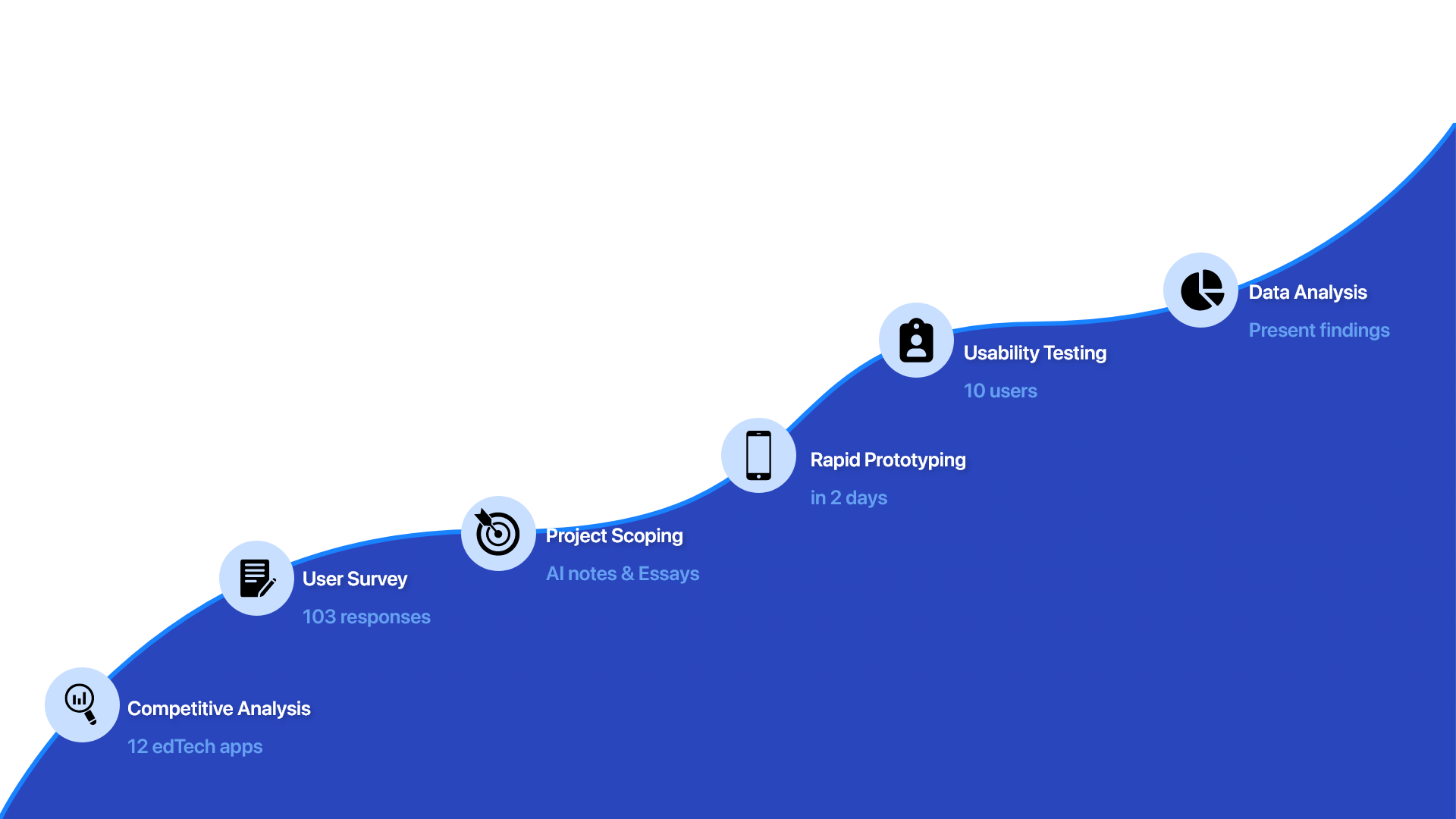
Rather than argue the direction, I put together a short research programme to test it: a competitive audit, a survey, and moderated usability testing.
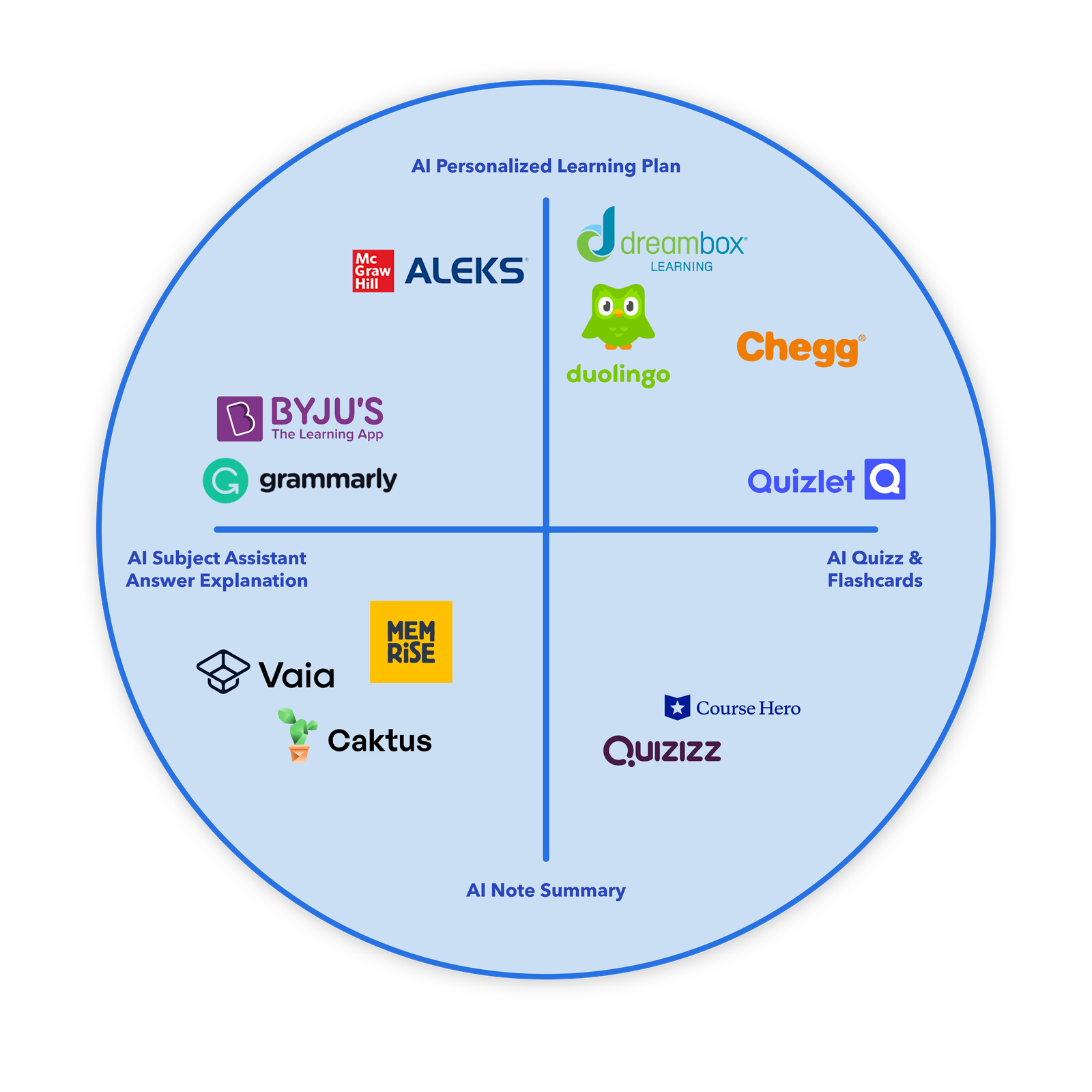
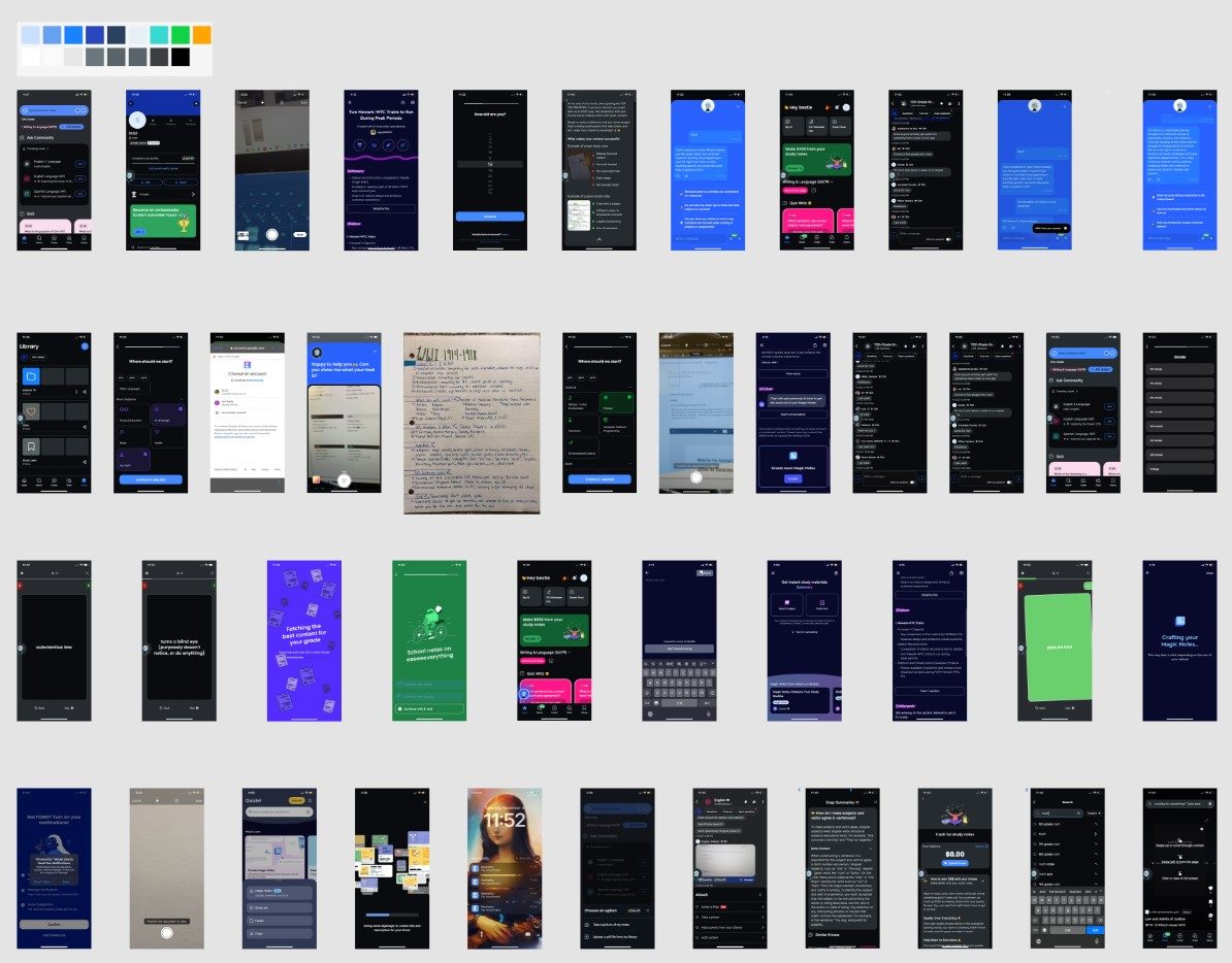
Competitive audit of 12 EdTech apps
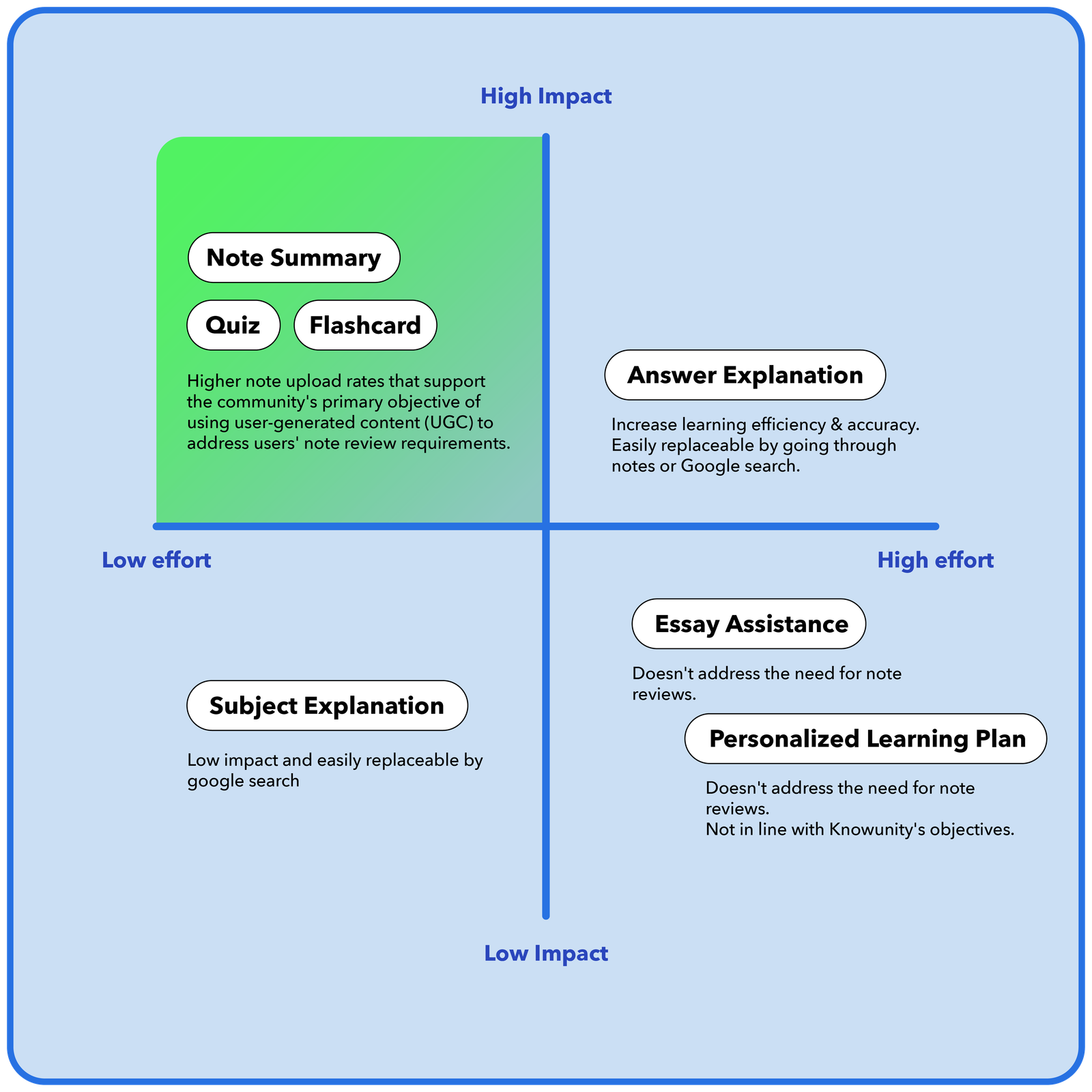
I led a competitive audit of AI features across 12 EdTech apps — Chegg, Quizlet, Duolingo, Course Hero, Grammarly, BYJU'S and others — and plotted them on the two axes that mattered: what kind of AI help they gave, and how personalised it was.
The map showed a crowded corner around quizzes and flashcards, a crowded corner around answer explanation — and a thin, under-served band around note summary. That gap was the opening. It also happened to be the thing Knowunity was uniquely positioned to own: the notes were already in the app.
Survey of 103 US students
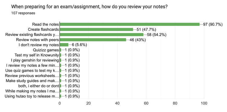
A short survey of US middle and high schoolers, to check our hypothesis against how they actually study. The results pointed toward note review rather than essay writing.
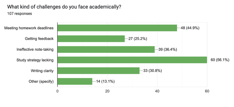
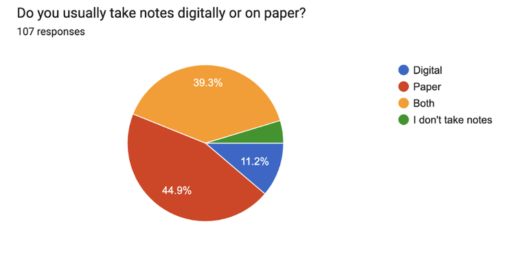
“STUDY STRATEGY LACKING”
45% OF THEM ON PAPER
FOR EXAMS
ITSELF INEFFECTIVE
Taken together, these point in one direction. Nearly every student takes notes and reviews them, and about a third find note-taking ineffective. Essay writing did not appear among the top three problems.
“Reviewing notes is the study routine. Essays are an event.”
THE REFRAME I TOOK BACK TO THE CLIENTPresenting the findings to the client
The findings pointed away from the client's initial direction, so how I presented them mattered. A few things shaped that conversation:
01 // LEAD WITH THE DATA
Let the research make the case
Rather than argue against essays directly, I presented the survey and competitive audit and let the findings carry the point. It kept the discussion about the users rather than about opinions.
02 // FRAME IT IN THEIR TERMS
Connect it to their business goal
The client's focus was sign-ups and engagement. So I framed note review in those terms: it's a near-daily habit, where essay writing is occasional, and a daily habit is more likely to support retention.
03 // USE WHAT THEY ALREADY HAVE
Build on an existing advantage
Competitors could build an essay tool, but Knowunity already held a large volume of student notes. A feature built around that content was harder for others to copy.
04 // SCOPE THE QUESTION
Agree on the problem, not the answer
We presented a scoped question — how might we use AI to better support note review? — and worked through the options with the client, so the direction was a shared decision rather than one handed over.
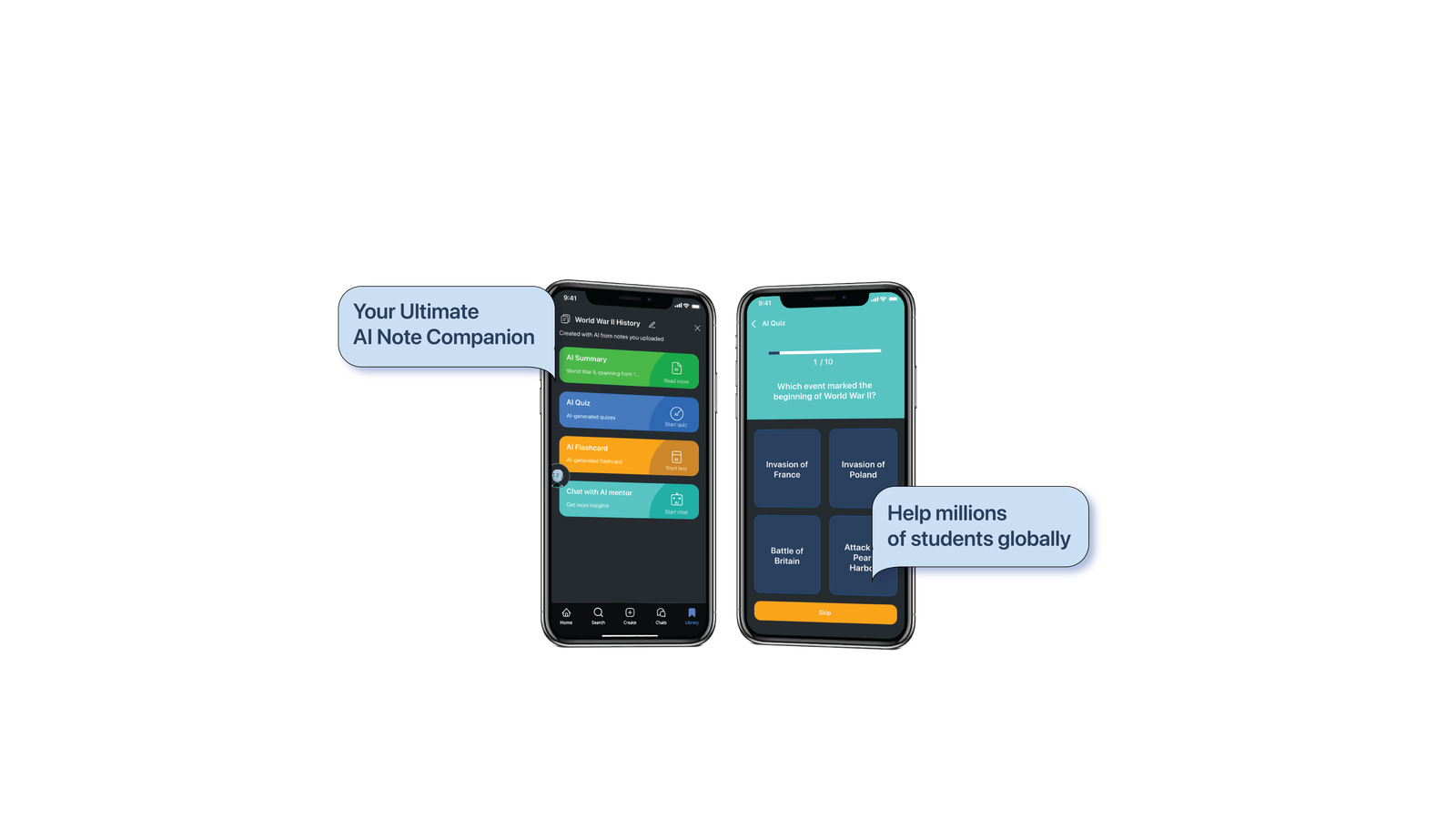
NoteGenius
Upload your notes. Get back four ways to actually study them.
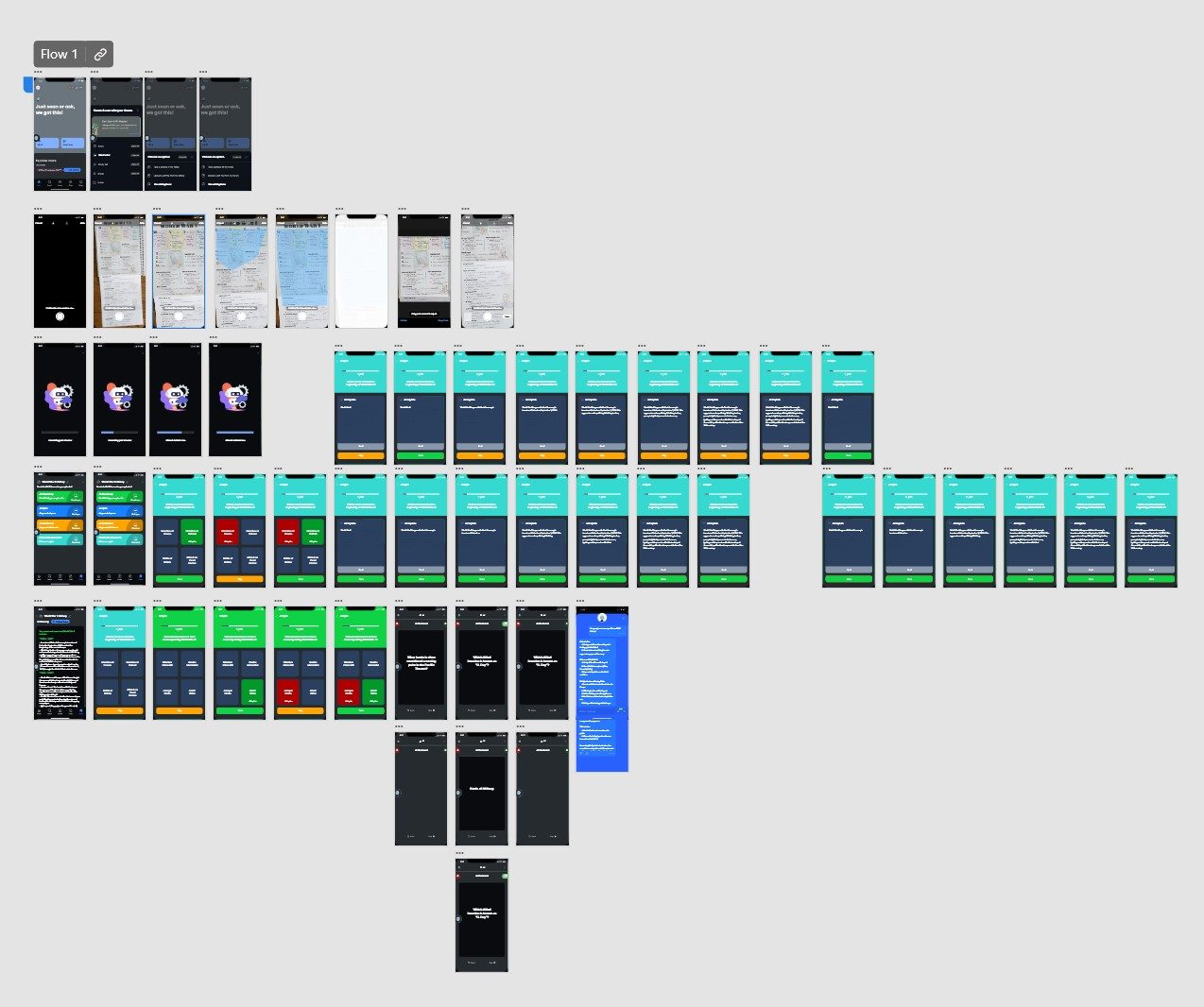
Photograph a paper page or drop in a PDF. AI turns it into a summary, a quiz, flashcards, and a study bot that has read what you wrote. One entry point, placed exactly where students already create notes.
“We skipped low-fi. Our users were kids — they tell you what they see, not what they imagine.”
WHY THE PROTOTYPE WAS HI-FI FROM DAY ONEThat decision cost me two intense days of solo hi-fi work. It bought us feedback about the product instead of feedback about grey boxes — which, with 12-year-olds, is the difference between data and noise.
Testing on 12-year-olds
10 moderated sessions. 400 minutes. Ages 12 to 17.
Kids are hard to interview. They give one-word answers, say yes to be polite, and lose focus fast. So I adapted: build rapport first, keep questions short, use follow-up prompts instead of a script, and watch what they do rather than what they say.
It was demanding, but the feedback was honest — a 12-year-old won't pretend to like something they don't.
OUTREACH → COMPLETED
15 → 10
Moderated, remote and in person
TOTAL ENGAGED TIME
400 min
~40 minutes per session
Scenario: “You have a History exam next week. Study your notes using different techniques.” Then I shut up and watched.
What they told us
-
10 / 10
AI quiz was the clear favourite
The runaway winner. Seven of ten had never used quizzes to review notes, and wanted to start. That's not a feature preference; that's a behaviour change.
-
6 / 10
Flashcards fit an existing habit
Slots into an existing ritual. Lower ceiling, but zero learning curve.
-
3 / 10
AI summary was the least preferred
We assumed summary was the hero. Students said they'd rather read their own highlights. The feature we were most confident about was the weakest one — and only testing caught it.
That last one is why we tested. If we'd shipped on conviction, we'd have led with summary and buried the quiz.
Three changes testing forced
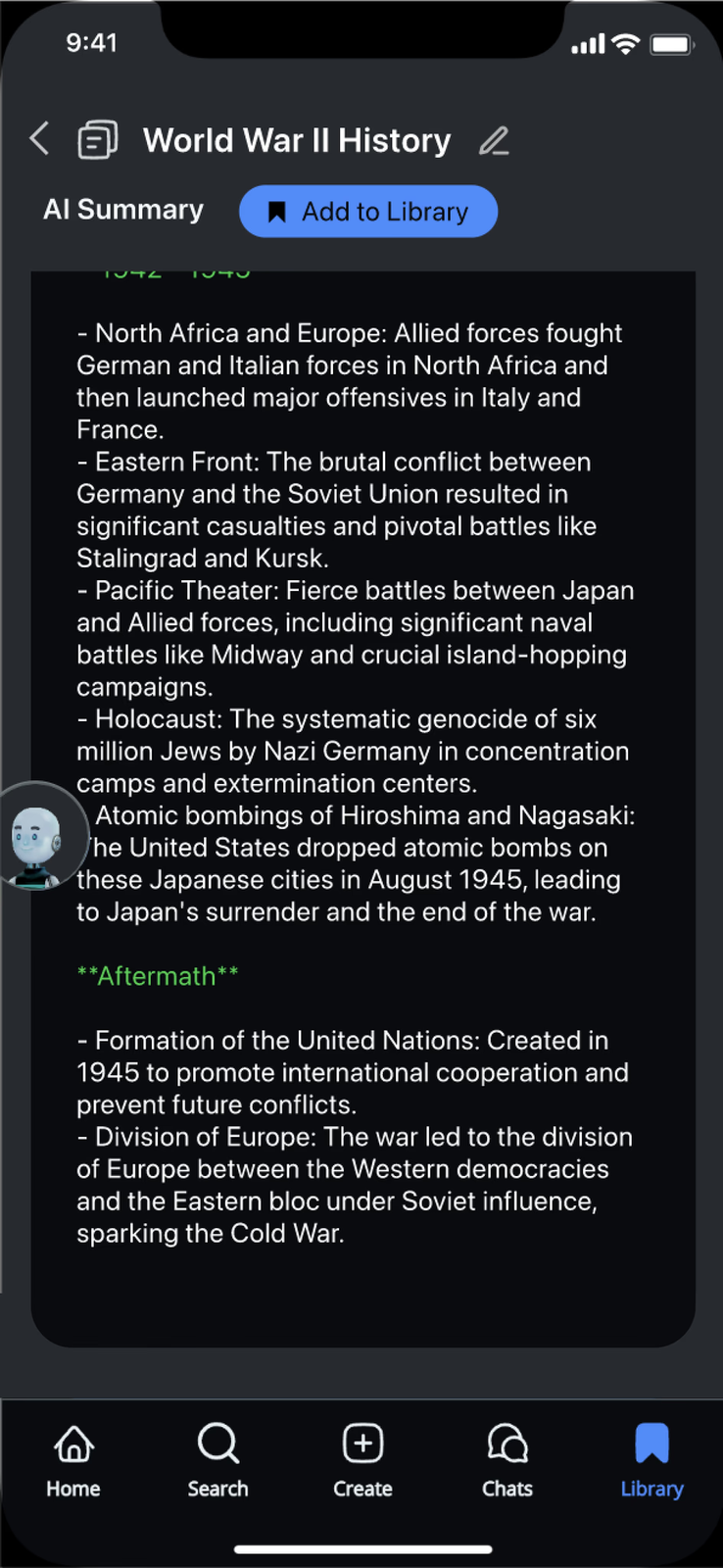
FIX 01 // SUMMARY
Give them the dial
Pain: students wanted control over length — skim it when time is short, expand it when it isn't.
Fix: added “simplify” and “expand”. The AI stops deciding how much you need.
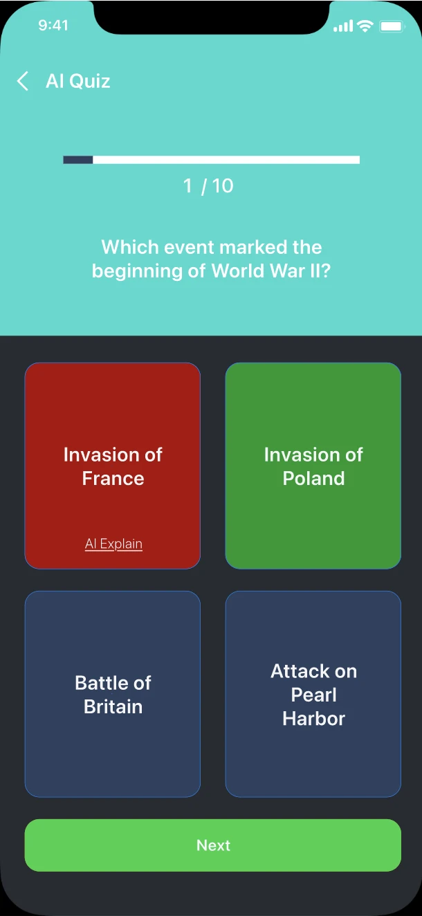
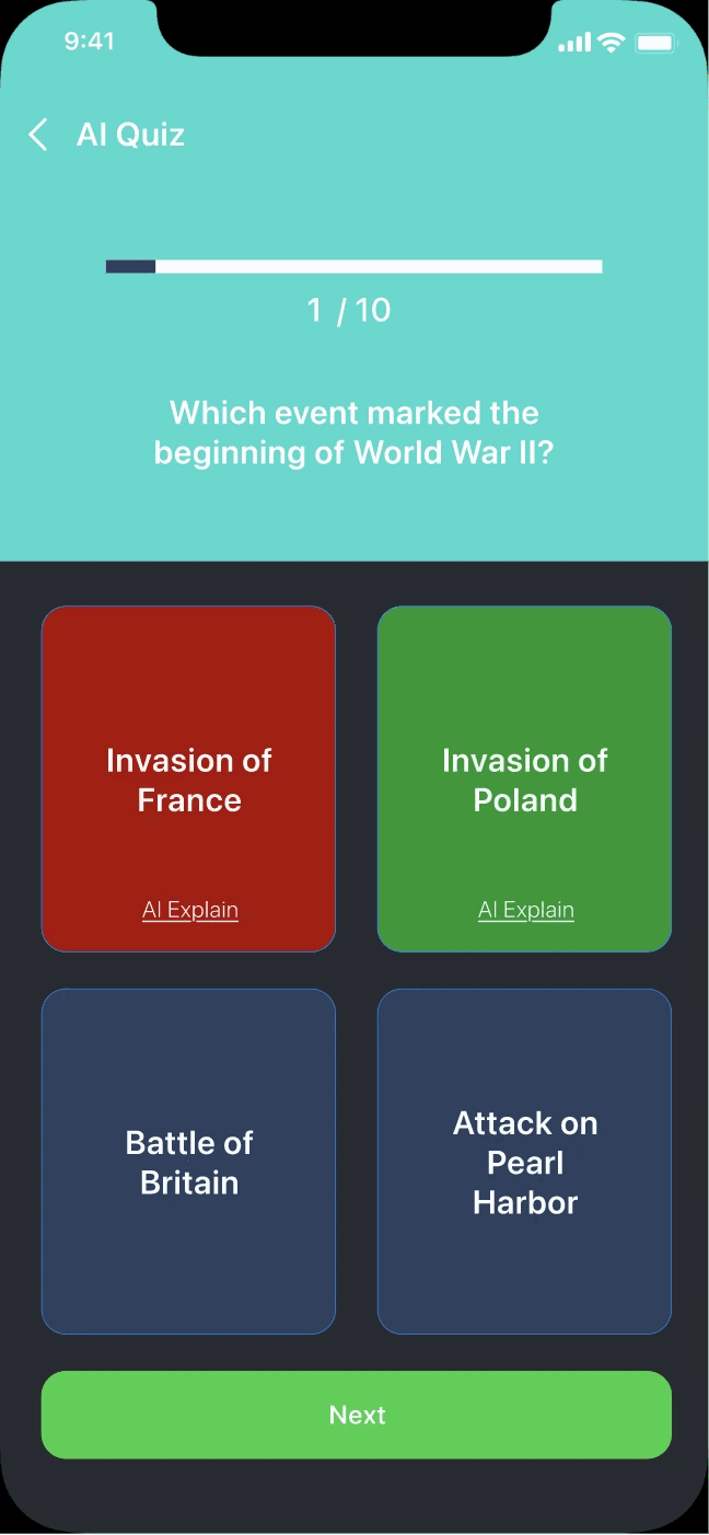
FIX 02 // QUIZ
Explain the right answers too
Pain: explanations only appeared on wrong answers — but students wanted to know why they were right, in case they'd guessed.
Fix: explanations on every answer. Being right by accident is still not understanding.
FIX 03 // FLASHCARDS
Let them use it wrong
Pain: designed for review — but 6/10 were using flashcards as a self-test and keeping score in their heads.
Fix: added a right/wrong progress tracker. The users had a better idea than the spec.
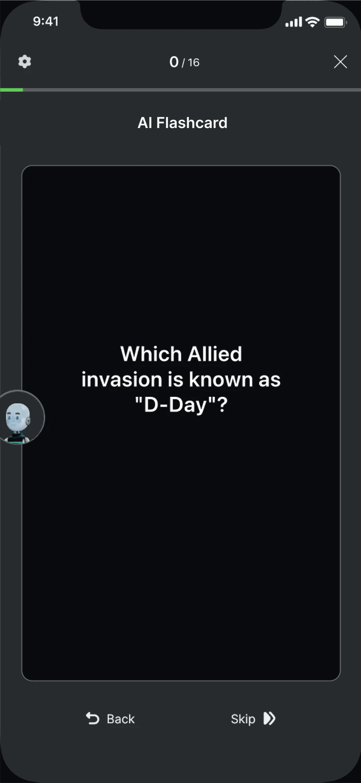
Craft note: Knowunity's edge is that studying feels fun. Micro-animations, a robot loading state, zoom transitions on quiz answers — here the craft is the differentiator, not decoration on top of it.
The final design
Three key moments from the final flow.
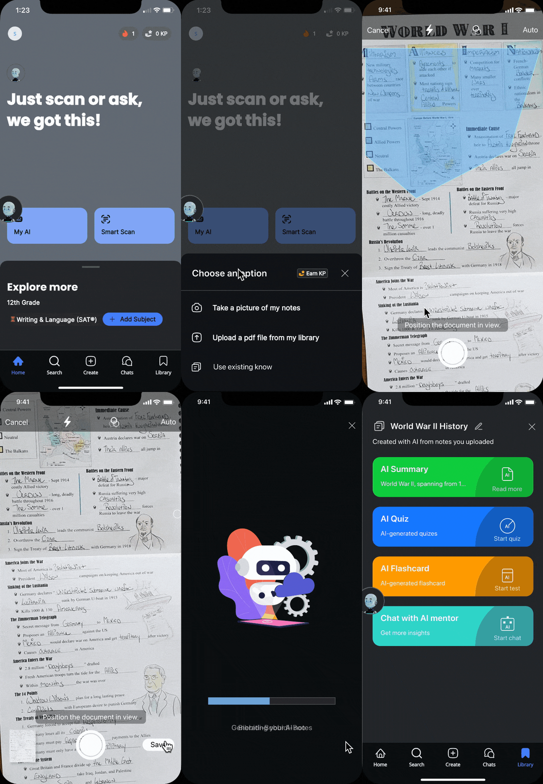
MOMENT 01 // ENTRY
Entry point and upload
A highly discoverable entry point, placed right next to where students already create notes and study sets — no new habit required.
And a robot loading animation, because the wait is part of the experience. It says “Bibbidi-Bobbidi-Boo” while it works.
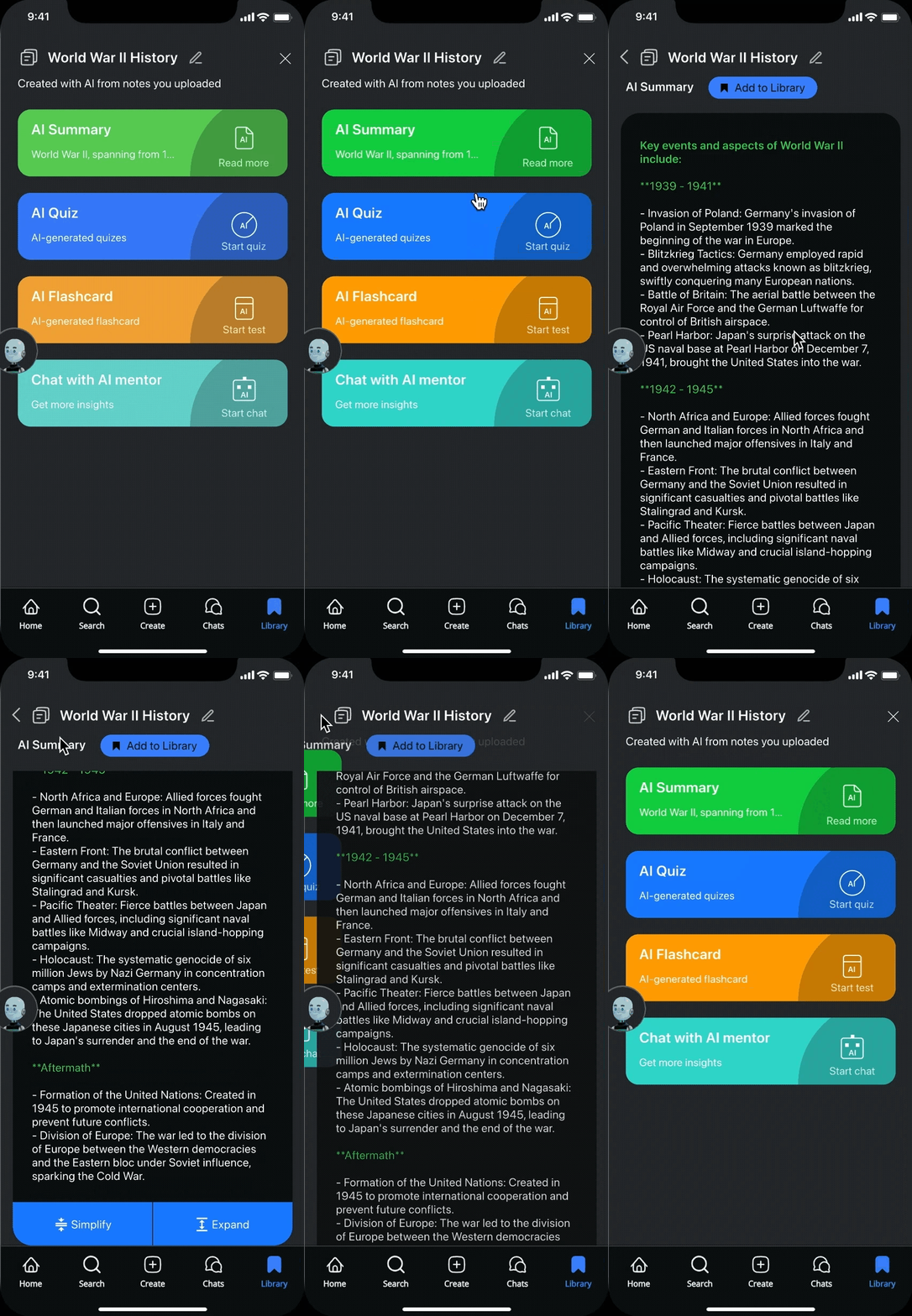
MOMENT 02 // GENERATE
Four ways to study, from one upload
Photograph a paper page or drop in a PDF. NoteGenius turns it into a summary, a quiz, flashcards, and a study bot — all generated from what you actually wrote.
The goal was never “more AI”. It was full control over how you use your own notes — which is what lifts upload and conversion.
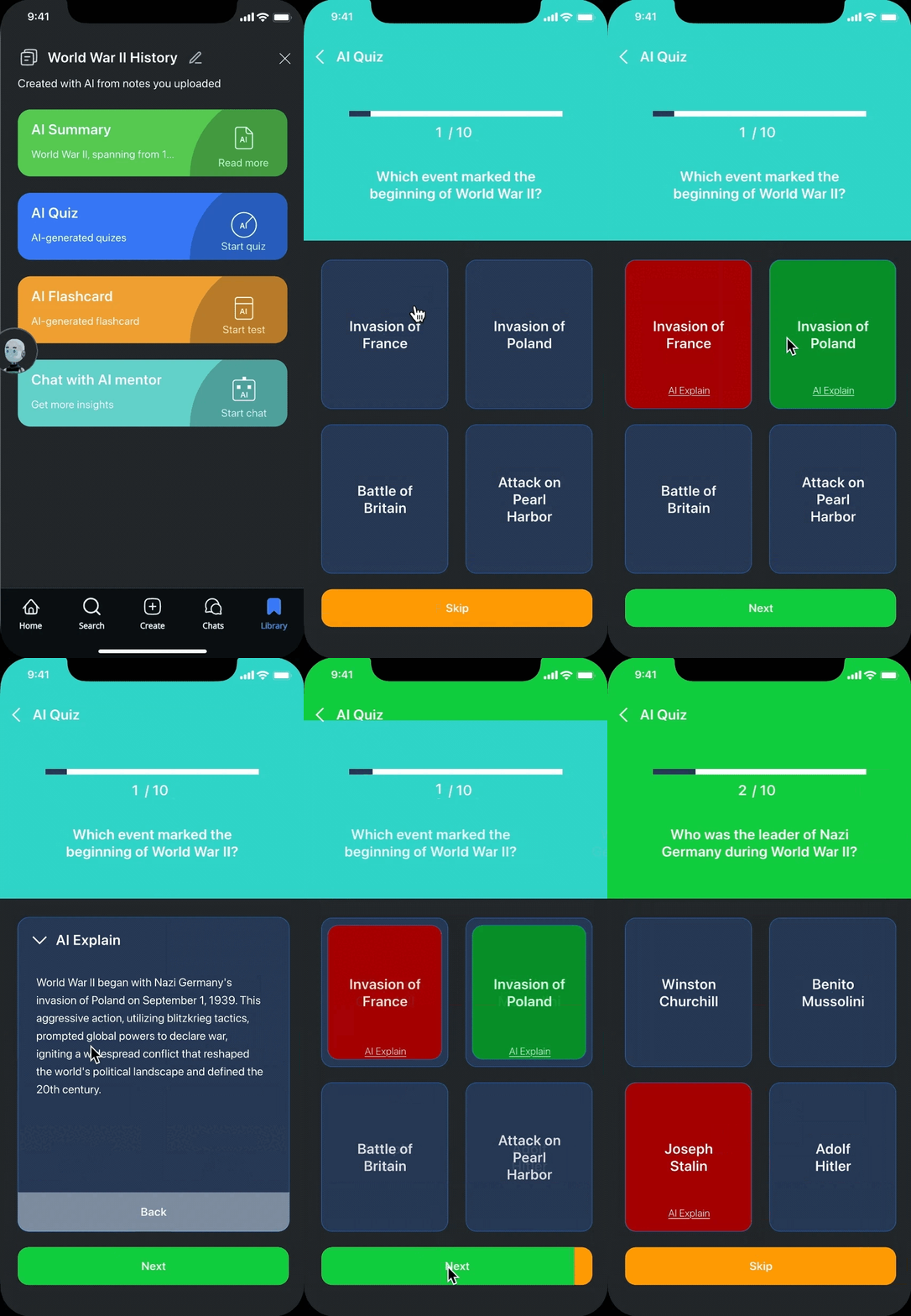
MOMENT 03 // QUIZ
Turning notes into a quiz
From that hub, notes become short AI quizzes — with explanations on both right and wrong answers. Micro-animations, zoom in and out, make it feel like a game rather than a test.
10/10 students loved this one. Seven of them had never reviewed notes this way before.
Result
USABILITY SATISFACTION
10 / 10
Every participant wanted the feature developed further
NPS — AFTER RELEASE
+25%
Within two weeks
15+ feature screens designed and shipped. The client's feedback was, in their words, overwhelmingly positive — and the conversation moved from “should we build this?” to planning implementation.
The roadmap changed. That's the outcome I'm proudest of: not the screens, the direction.
What we'd have done next: fix the AI summary's accuracy against the diverse needs testing exposed. Ship an MVP of quizzes and flashcards to validate at scale. And rethink the chat buddy — functional wasn't the bar; delightful was.
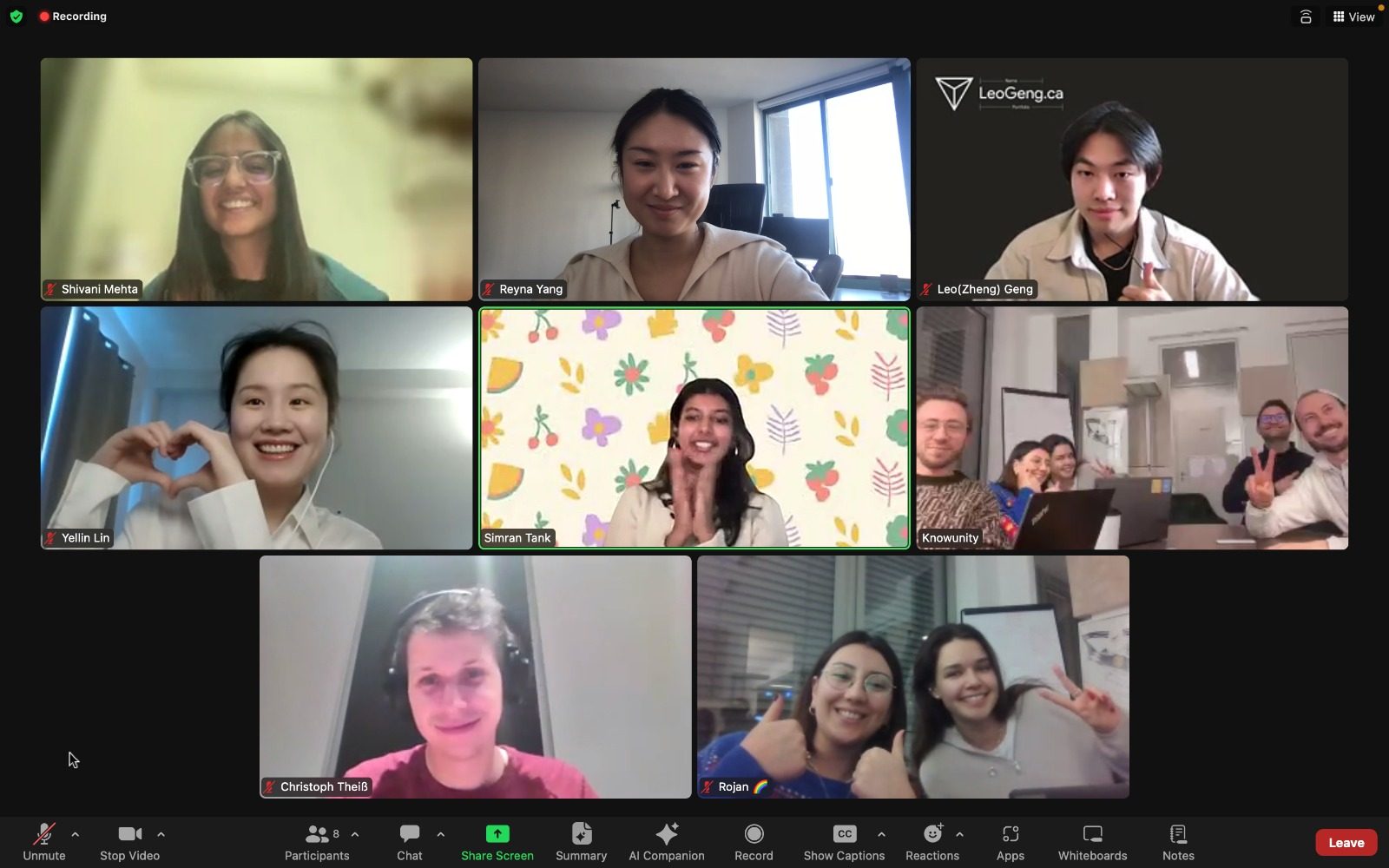
Reflection
The best thing I can do for a stakeholder is help them succeed — and let it stay their decision.
I used to think the strongest argument wins. It doesn't. Evidence wins, but only when it's framed around what the other person is trying to achieve. The client wasn't being stubborn about essays; it was the visible, competitive, defensible choice. My job wasn't to override that instinct — it was to offer a better option and let them choose it.
The second lesson came from the kids. Research methods aren't universal. Everything I knew about moderated testing assumed an adult who'd sit still and narrate their thinking. Twelve-year-olds do neither. Adapting — rapport first, shorter questions, watch the hands not the mouth — is a skill I now use on adults too.
And the summary result still sits with me. We were most confident about the feature users cared least about. That's not an anecdote about this project. That's the argument for testing everything.
“Learn how to make stakeholders successful, because if we can help them be successful, that will help us be successful as a by-product.”
TOM GREEVER — ARTICULATING DESIGN DECISIONS