CASE 01 // FINTECH · MOBILE + WEB · B2C
Intelligent Investing — managed and self-directed investing
I lead end-to-end design for two products at Orion Digital (formerly Mogo): Moka, for automated investing, and Mogo, for self-directed investing. This case focuses on two areas I owned — the Investor Memo and the Wealth Calculator.
SKIP THE READING
See the visuals
30-SECOND READ // FOR THE HIRING MANAGER
WHAT I OWNED
- End-to-end design for two flagship products — Moka (automated) & Mogo (self-directed)
- UX/UI, flows, design system, brand, motion, marketing site
- Product copy & the behavioral model behind it
WHAT MOVED
- 36% YoY wealth revenue growth
- AUM $498M, up 17%
- ARPU $10 → $20 (2×)
- Flagship feature engagement +104%
HOW I WORK
- Design within real constraints, including compliance
- Use AI as a tool in the process, not a shortcut
- Remove screens when a flow reads better without them
The top three figures are company/product results the whole team contributed to; the +104% is the engagement lift on the Wealth Calculator work shown below.
Context
Intelligent Investing brings savings automation, portfolios, and tracking into one product family.
It ships as two products for two different users:
Moka — automated wealth management. The disciplined investor's autopilot: goal-based investing, automated contributions, rebalancing.
Mogo — self-directed investing. For the hands-on allocator: zero commission, institutional research, and a mode built for behavioural stillness.
The business problem underneath both:
Retail investing apps are optimised for activity — because activity looks like engagement. But activity is precisely how retail investors lose money. Every tap we celebrate is a tap that erodes the customer's returns, and with it their reason to stay.
The design direction followed from that: help users act more deliberately, and optimise for the long-term account rather than trade count. In practice that meant designing for retention and assets under management, not for activity.
Deep dive — Investor Memo & Calibration
Buying a stock takes a few taps, but the app never records why the investor bought it.
When a position later drops, the investor has no record of their original reasoning, only a memory of it. That makes it hard to separate a bad decision from bad luck, and hard to learn from either.
The Investor Memo adds the missing record: a written case attached to the position, and a way to check it against what actually happened.
The main design tension was that a memo adds friction, and friction usually lowers conversion. In consumer fintech the default instinct is to remove it.
I argued this was friction worth keeping, because it protects the customer's capital and, in turn, the assets they leave on the platform. The trade-off was that the flow had to justify each step, so it wouldn't feel like paperwork.
“Every position begins with a memo. The flow records that judgment. It does not produce it.”
PRODUCT COPY — WRITTEN BY ME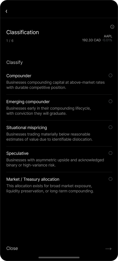
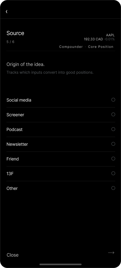
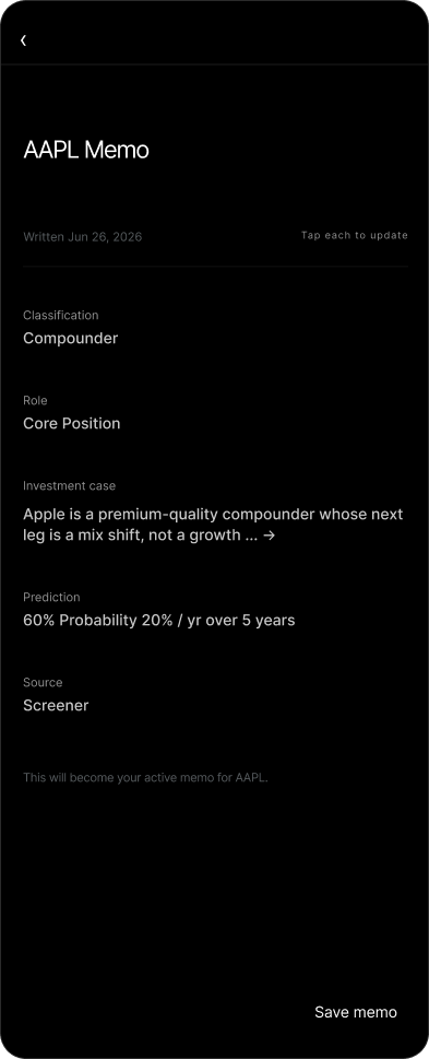
The Active (buy) flow. Six screens, each one a question the investor should already have answered — and a review that ends with “Tap each to update.” The memo is never finished; it's maintained.
The principles it's built on
The system informs. It never decides. The memo is a draft of judgment, not a verdict. You can skip it entirely — but skipping is recorded as a position opened without a case. We don't block; we keep an honest record.
Benchmark against a scorekeeper you don't control. The moment a memo is saved, the position starts being scored against the S&P 500 over the horizon the investor declared. Not our number. Not a number they can move.
The record compounds. Every re-underwrite is dated and kept. Over time the investor isn't just holding positions — they're accumulating evidence about their own judgment.
Reality settles it. Resolution rules are fixed at the moment of prediction and can't be edited after the fact. This is the entire integrity of the feature: you don't get to grade your own paper.
“A memo you never revisit is a note. A memo you score is a practice.”
PRODUCT COPY — WRITTEN BY MEAnatomy of a memo — five fields
-
01ClassificationTEACHES
What kind of bet is this? Each option carries its own teaching copy — what you're betting on, how you'll know you're wrong, the expected holding period, and how the category is commonly misused.
COMPOUNDER / EMERGING COMPOUNDER / SITUATIONAL MISPRICING / SPECULATIVE / MARKET · TREASURY ALLOCATION
-
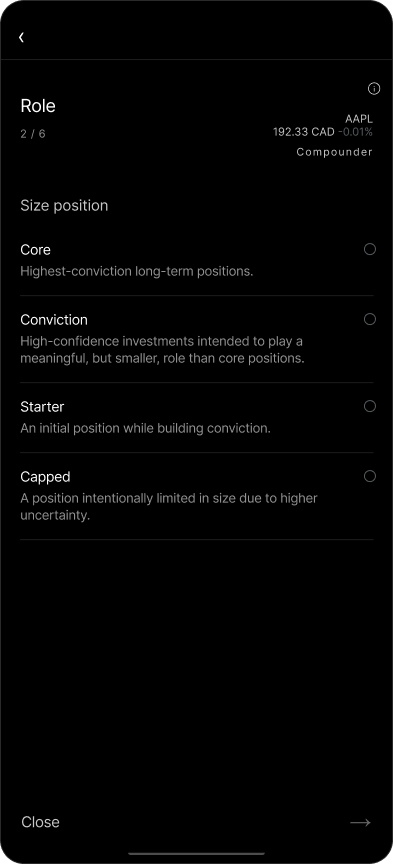
02RoleRENAMED FROM “SIZING”
What job does this position do in the portfolio? The screen still asks you to “Size position” — but every option is described by its job, never by a percentage. That rename was the compliance fix; see the decision below.
CORE / CONVICTION / STARTER / CAPPED
-
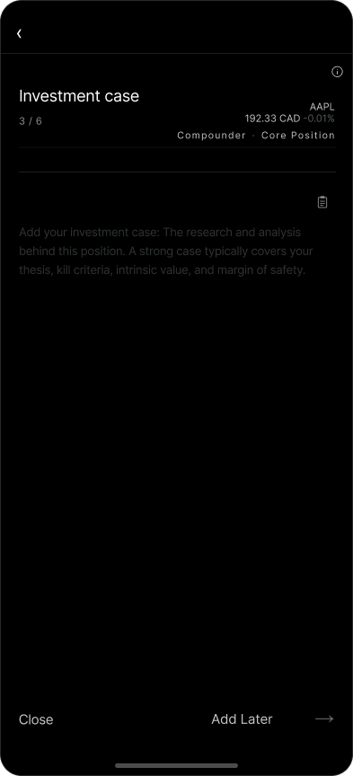
03Investment caseTHE SUBSTANCE
Thesis, kill criteria, intrinsic value, margin of safety. Backed by two research tools — but the prompt returns questions, never answers. You can defer it with “Add Later”; the stock page will then carry the label “Investment case not recorded.”
THESIS / KILL CRITERIA / WHY NOW / INTRINSIC VALUE / MARGIN OF SAFETY
-
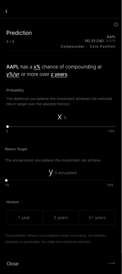
04PredictionTHE CALIBRATION ENGINE
Three inputs compose one falsifiable sentence, assembled live at the top of the screen — “AAPL has a x% chance of compounding y%/yr or more over z years.” Now there's something reality can disagree with. The footnote does the compliance work: “This prediction reflects your judgment under uncertainty, not platform forecasts or guarantees.”
PROBABILITY (SLIDER 0–100) → RETURN TARGET (SLIDER 15–100 %/YR) → HORIZON (1Y / 3Y / 5+Y)
-
05SourceHONESTY
Where did this actually come from? “Tracks which inputs convert into good positions.” Declaring the origin is uncomfortable on purpose — it's the first place self-deception shows up, and over time it tells you which of your sources actually earn money.
SOCIAL MEDIA / SCREENER / PODCAST / NEWSLETTER / FRIEND / 13F / OTHER
“Research is an input. Judgment is the decision.”
RESEARCH PROMPT — QUESTIONS ONLY, NEVER ANSWERSOnce a memo is scored, the prediction stops being a feeling and becomes a data point. Plotted over time — predicted probability against actual accuracy — the pattern either drifts toward the diagonal or it doesn't. That's the whole product in one chart: not whether you were right, but whether you know how often you're right.
“Calibration is a practice, not a score.”
CALIBRATION VIEWThree flows, one grammar
Every flow resolves to the same review screen pattern, so the app teaches itself. What changed most between versions wasn't what I added — it's what I took out.
ACTIVE / BUY
CORE / PASSIVE ALLOCATION — CUT FROM 4 SCREENS TO 3
SELL / EXIT
The Resolve screen is where the memo gets checked against reality. I laid it out as two boxes with identical structure — the prediction on one side, the actual result on the other, same metrics in the same order — so the comparison is direct and hard to rationalise away. The point isn't to be right every time; it's to give the investor a clear read on how their judgment is doing.
Four decisions I'd defend in a review
DECISION 01 // COMPLIANCE AS A DESIGN MATERIAL
Removing every percentage from position sizing
Showing “Core = 20–40%” reads as financial advice — a real regulatory line for a licensed platform. Instead of arguing for the number, I renamed the field from Sizing to Role, moved the guidance into an info popup, and softened every verb (often, may, around, “common conventions, not recommendations”). Then I swept the entire app so no stray range survived in options, review, field reference, or fallback copy. The feature got clearer — the constraint improved it.
DECISION 02 // RECORD, DON'T CLAIM
Rewriting the sell flow from “executed” to “recorded”
The original copy implied we'd placed the trade. We hadn't — and implying it is a liability. I rewrote the flow to describe a recorded decision: “Record exit” as the CTA, planned exit date and price, and “Sold 100%” became “Full exit — selling 100%.” Precision in language is product design in fintech.
DECISION 03 // SUBTRACTION
Deleting a screen instead of decorating it
The Core flow started at four screens. Two of them (Core·3, mc4) were asking for input the system either already had or didn't need. I cut them, aligned the remaining three to the Active flow's components, and made the review screen structurally identical. Fewer screens, one grammar, less to learn.
DECISION 04 // LET THEM SKIP
Designing the escape hatch on purpose
Forcing a memo would have made the feature a wall, and users route around walls. So skipping is allowed — and recorded, as “opened without a case.” The stock page carries the absence quietly. No nag, no block, just a record the investor has to look at. Consequence beats coercion.
The Allocator's Guide — designing where AI stops
Every fintech is shipping an AI assistant that sounds confident and is occasionally, invisibly wrong. In a product about judgment, that's not a bug to patch later — it's an existential design problem.
So I wrote the AI's job description into the product itself: you are the allocator; the model is an associate. I named the four things a model can never do — verify, decide, bear the consequence, or be calibrated — and the five ways it characteristically fails.
The five failure modes, named in-product:
Smoothing · Clustering · Narrative confidence · Sycophancy · Staleness
And the operating rules: run every idea through it, revise before you commit, attack the conclusion rather than collect it, record the probability and come back to check — and never let it size a position.
“You are the allocator. The model is an associate. The market grades the decision.”
THE ALLOCATOR'S GUIDEDeep dive — Wealth Calculator
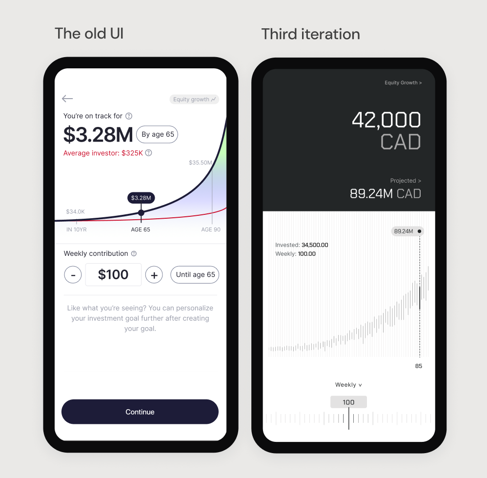
The Wealth Calculator showed a projected value, but not how a user could influence it. That made the result hard to interpret or act on.
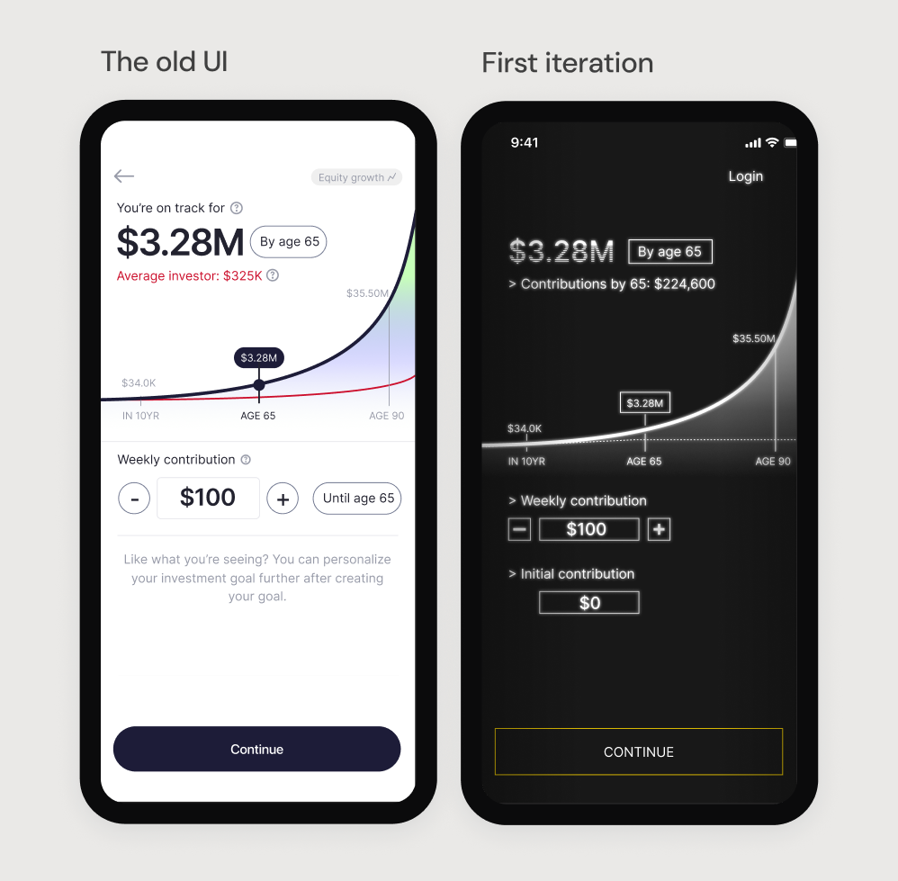
The calculator visualises how recurring contributions grow over time, and it sits at a point where users decide whether to commit. It wasn't performing well: the visuals were dated, the weekly-versus-one-time contribution model was confusing, there was a lot of data with no clear order to read it in, and an “average investor” comparison that users didn't find useful.
Two internal metrics pointed at the same problem:
TIME ON PAGE
~42s
Across the page and its sub-pages
SENTIMENT SCORE
~53/100
Consistently low
I set the goal for the redesign as: make the contribution-to-growth relationship easy to read, reduce what the user has to process at once, and support the different portfolio types, while fitting the evolving visual language. [Metrics are internal analytics from the team's tooling.]
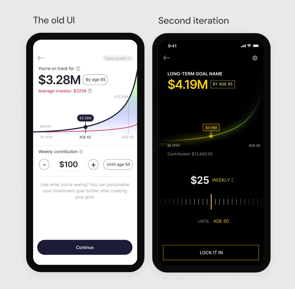
Four iterations, shipped across releases
-
ITERATION 01
Cut the comparison, raise the first deposit
Added an initial contribution field to drive higher first deposits. Removed the “average investor” comparison that tested as demotivating. Simplified tooltips and committed to a bolder visual voice.
-
ITERATION 02
Make the projection tactile
Introduced an interactive graph — scrub through age and watch projections update live. Added a “contribute until age” marker to frame the long term. Stripped cluttered lines to let the gesture carry the meaning.
-
ITERATION 03
One experience, two products
Unified managed and self-directed. Evolved the visual style toward high-status minimalism. Made compounding legible by showing current value against projected value — and added double-tap reset for rapid scenario testing.
-
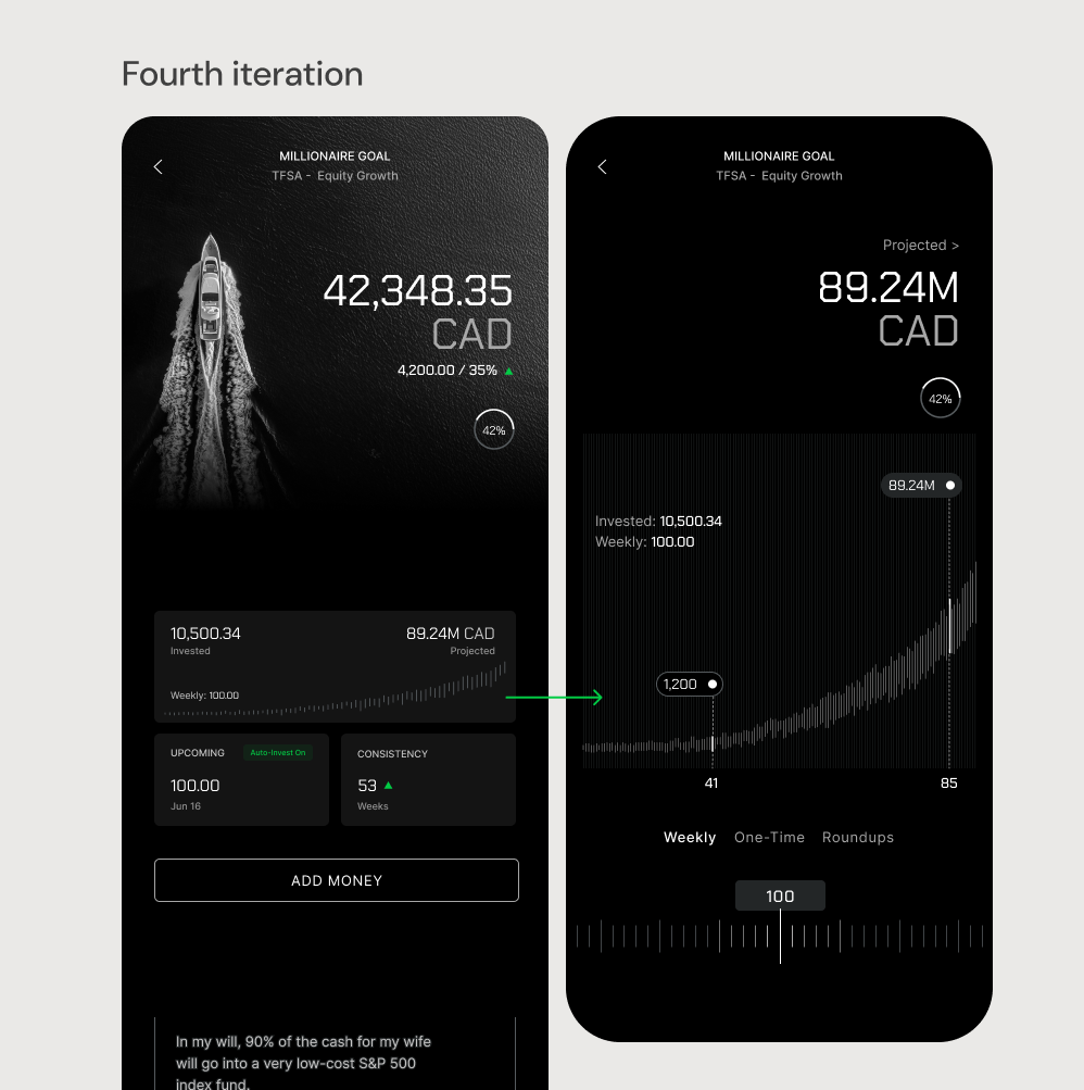
ITERATION 04
From tool to goal
Turned the feature into a goal-driven projection tool with messaging personalised by user profile. Shipped a widget version for daily motivation. Refined typography, motion and depth to project trust during volatility.
Result
TIME ON PAGE — BEFORE → AFTER
42s → 86s
Users spent longer exploring their projection
SENTIMENT — BEFORE → AFTER
53 → 71
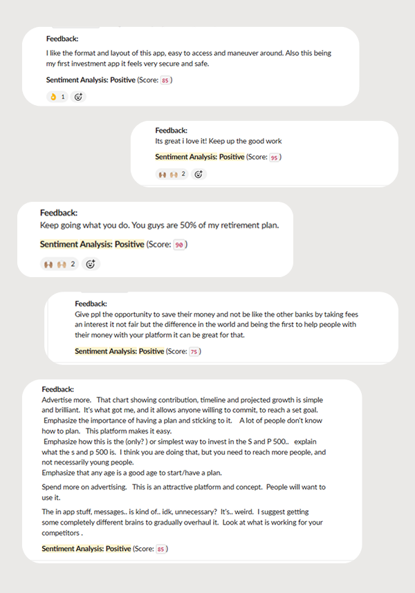
Feedback described it as clearer and easier to read
The redesign later became the visual reference the team used for other product modules. [Before/after figures are internal analytics; the sentiment score is from the team's feedback tooling.]
Reflection
Both projects were less about adding features and more about deciding what the product should encourage.
With the Wealth Calculator, the useful work wasn't a new feature but reframing an existing one around the relationship users actually needed to understand. It moved a page that wasn't performing well into a clearer step in the flow.
The Investor Memo went further into product thinking: the goal was to give the customer a record of their own reasoning that they can later check against reality, rather than another way to act quickly.
It also changed how I think about compliance. The constraints I was given — no percentages, no language implying execution — pushed the design toward being more accurate about what the product does. The version that cleared legal review was one I was comfortable defending on its own terms.
UI Archive
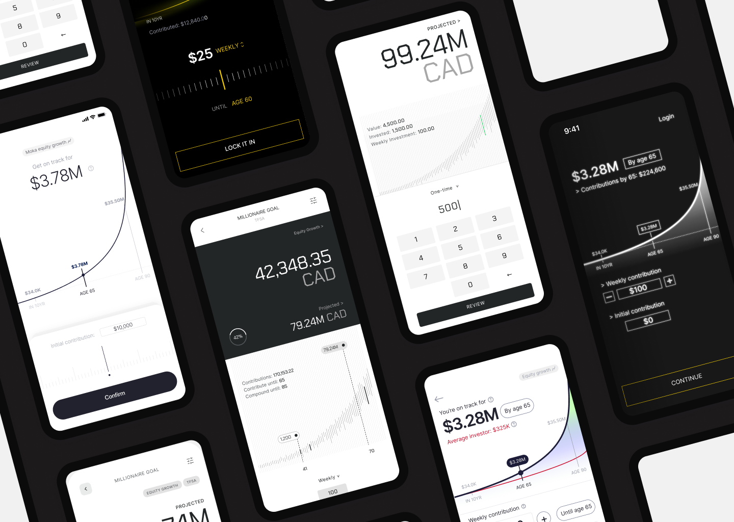
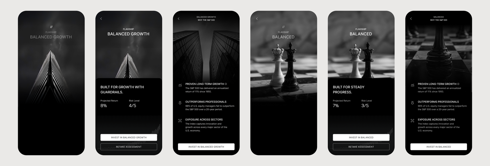
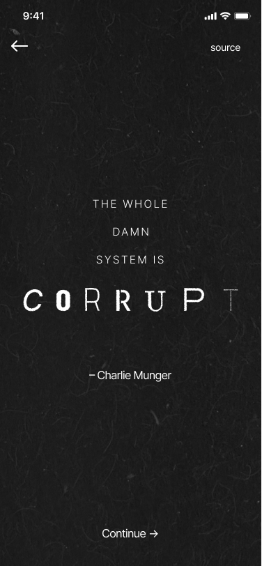
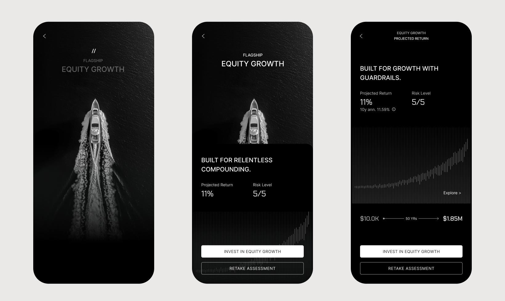
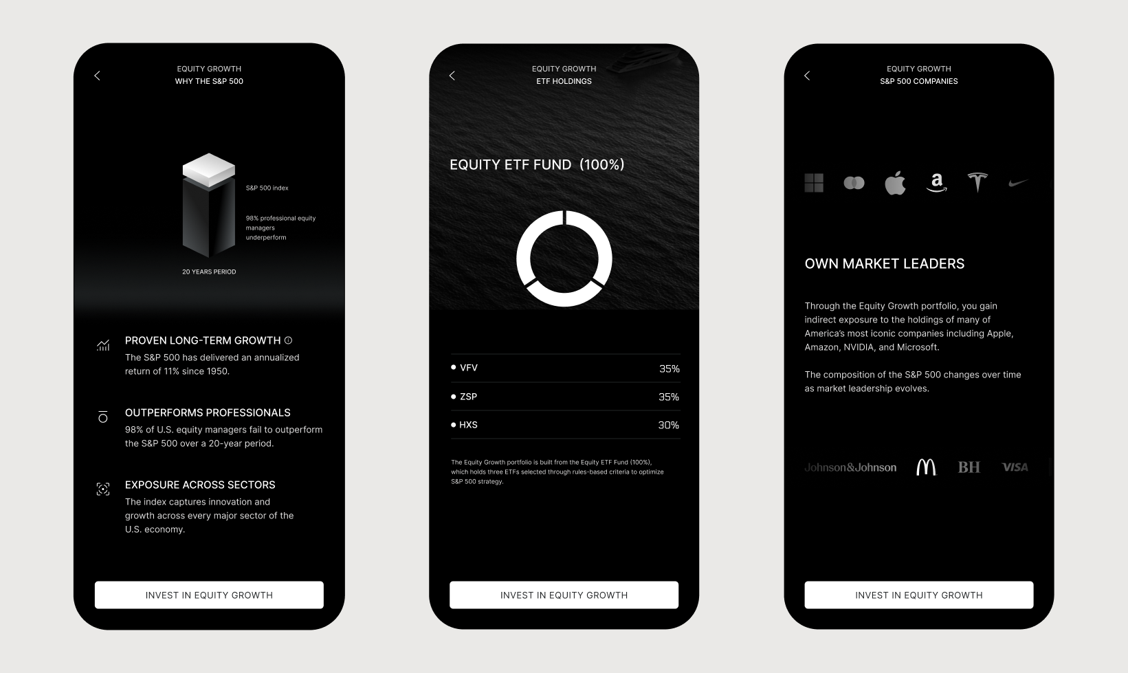
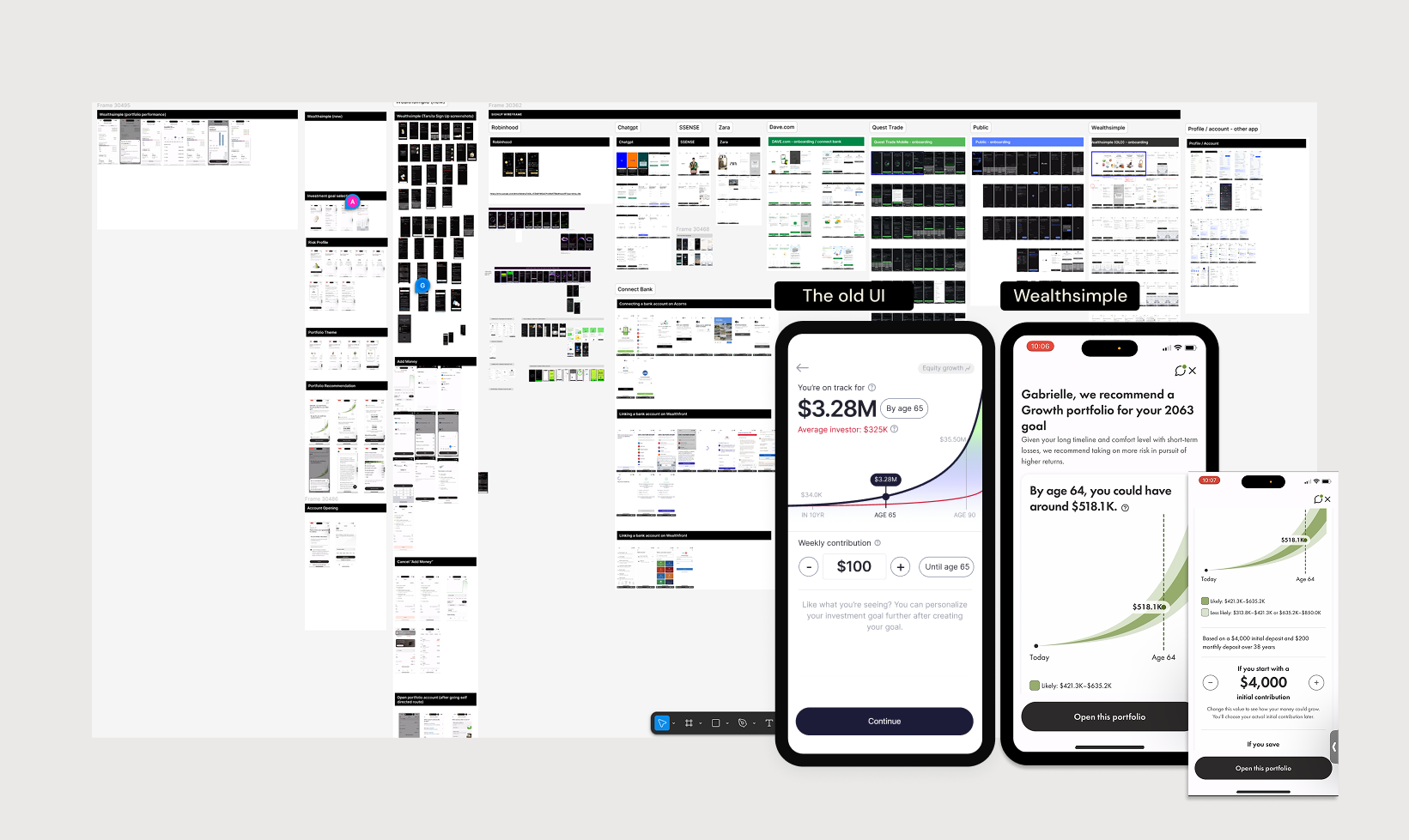
Screens, flows and explorations from across both products — shipped work and the versions that led to it. Hover any image for colour.



Motion & Brand
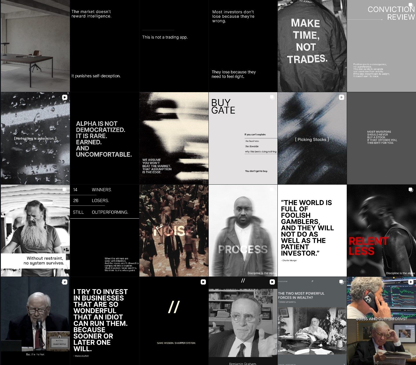
Motion and brand work from across the product — the launch film, in-app micro-interactions, goal flows, and logo studies. Everything here I designed and animated. Hover any clip for colour.