CASE 03 // B2B · B2C · SAAS · IOT · PUBLIC SECTOR
Kefen — product design for travel and healthcare
When China reopened after COVID, it accelerated a push to digitise cities. Over six months at Kefen, I designed interfaces across one province's version of that — public apps, government dashboards, a no-code web builder and health kiosks.
30-SECOND READ // FOR THE HIRING MANAGER
WHAT I SHIPPED
- 7 products across 4 surfaces
- Public app · 5 city dashboards
- A no-code web builder + the sites built with it
- Policy SaaS · health kiosks
WHY IT'S HARD
- Users: tourists, officials, operators
- The buyers weren't the users
- Middle-aged users, low digital literacy
- A fixed 6-month clock
SKILLS ON SHOW
- Range — 4 platforms, one voice
- Design systems built to scale
- Reading who really decides
- Shipping under real constraint
CONVERSION
ACROSS THE NETWORK
DASHBOARDS
SEARCHABLE
Overview
One designer across five projects, for three very different kinds of user.
I contributed to the design of interfaces, apps and IoT systems for both government agencies and private companies, across travel and healthcare — spanning B2B, B2C and SaaS. The work ranged from public-facing tourism platforms to backend dashboards for emergency coordination.
The structural challenge stayed the same across every product: three groups with nothing in common. Tourists want to book a ticket and find a toilet. Operators need to know if a scenic area is over capacity right now. Officials need to justify budget and prove policy is working — and they were usually the ones paying.
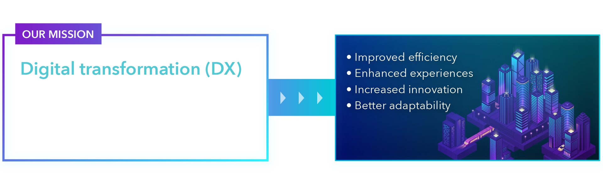
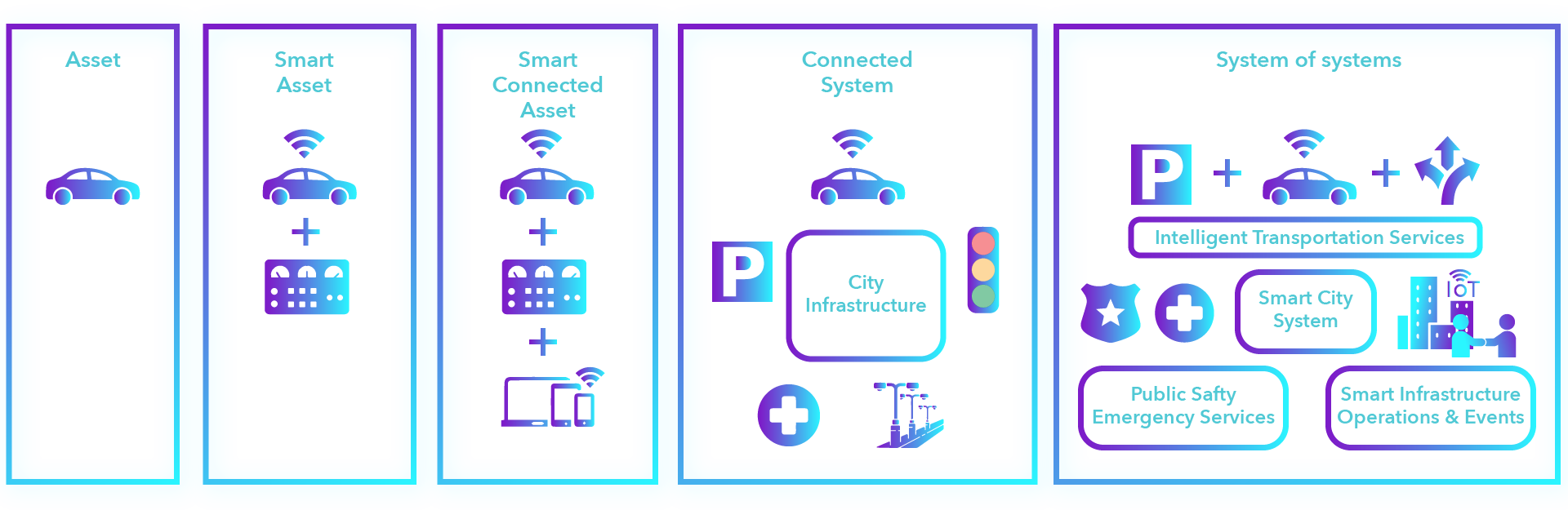
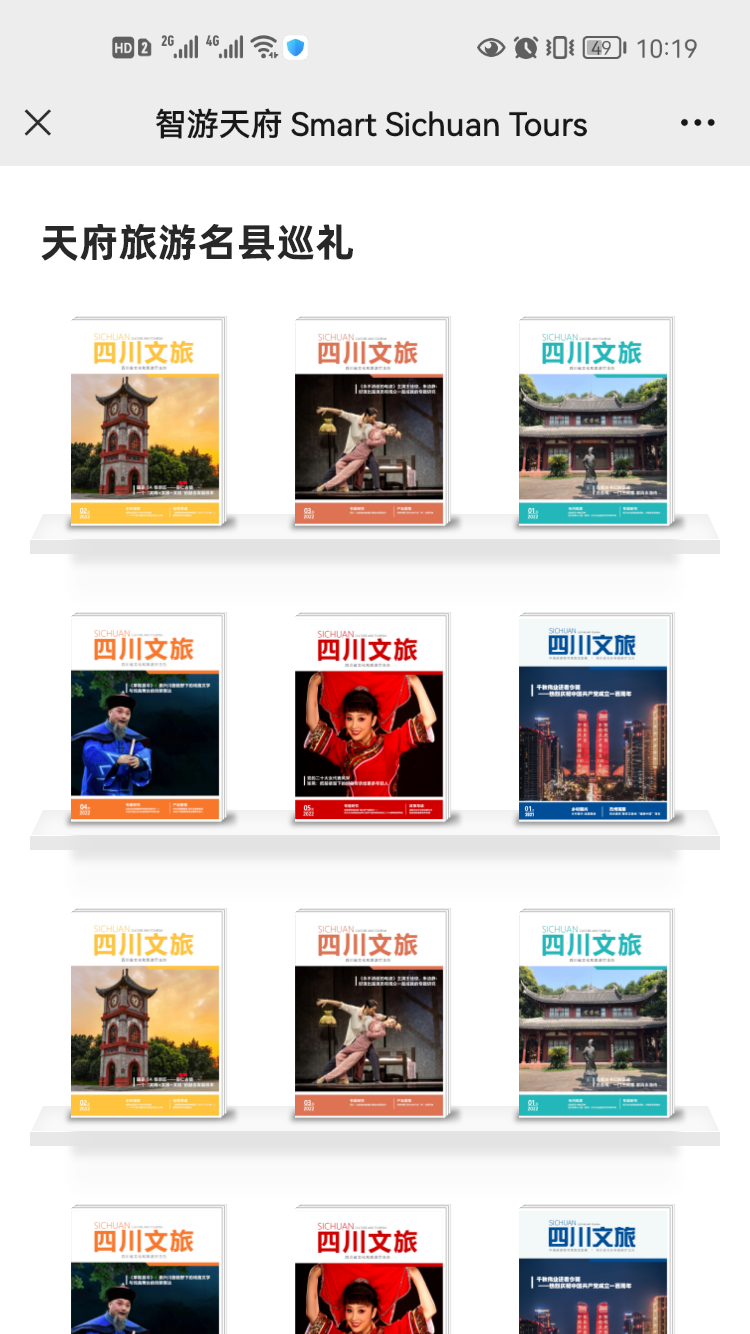
01 — Smart Travel Tianfu
A one-stop public service platform for a whole province — delivered as an app, mini-programs and WeChat accounts.
Sichuan set out to digitise its culture and tourism sector back in 2019. COVID delayed it — which made finishing it a priority for the recovery.
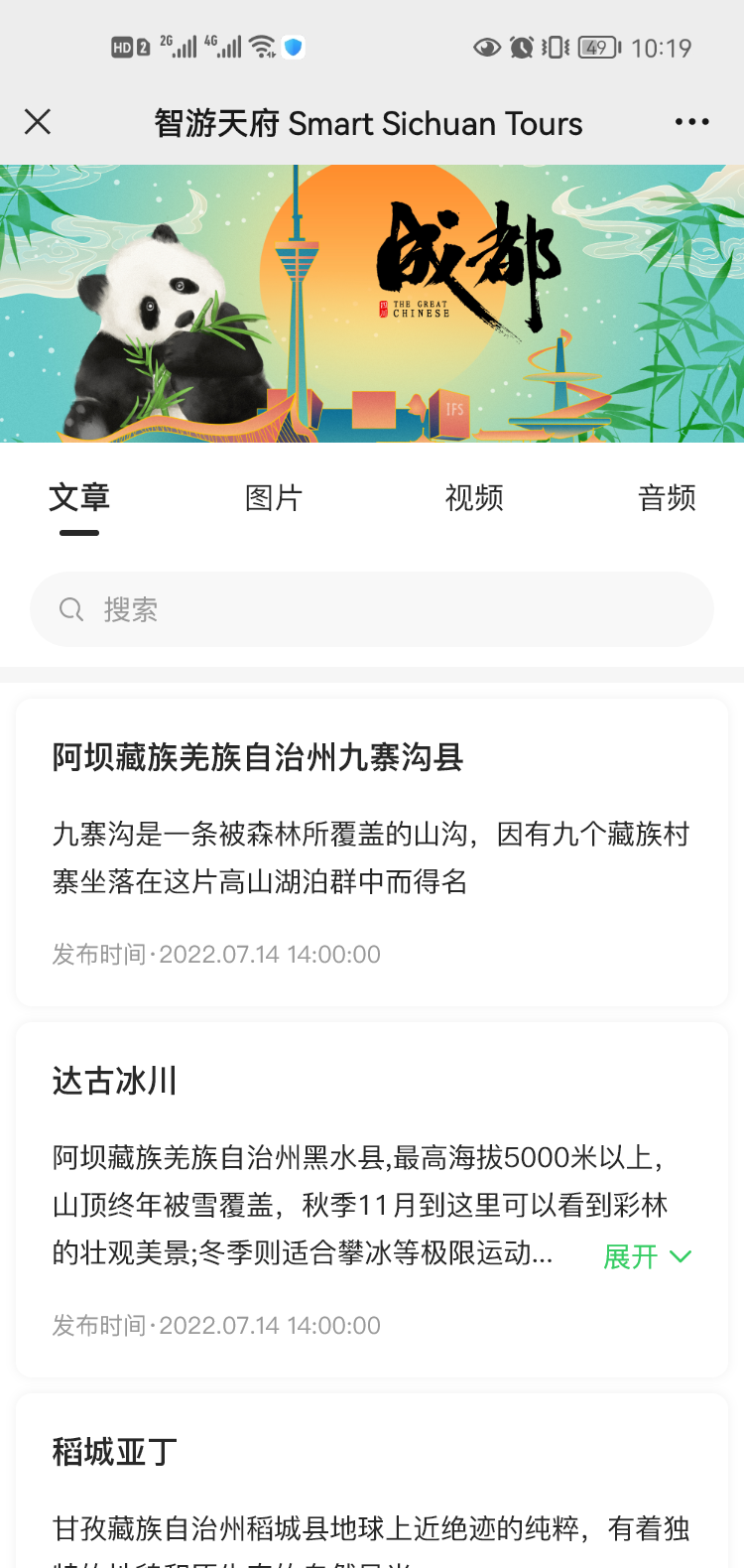
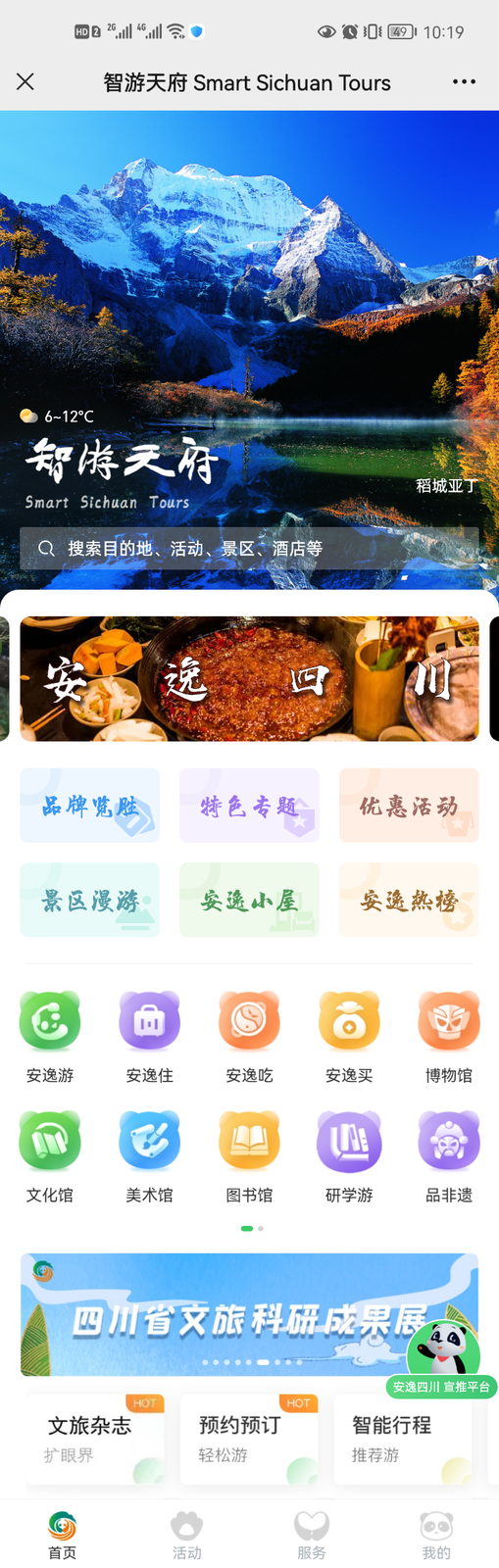
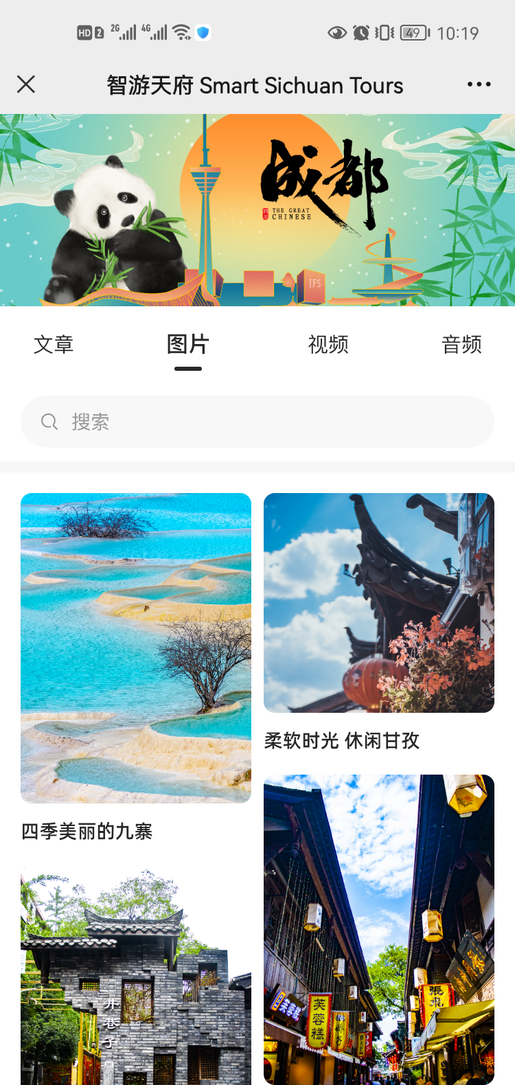
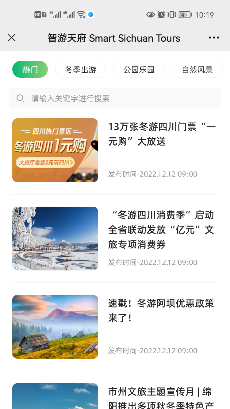
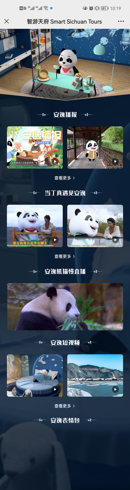
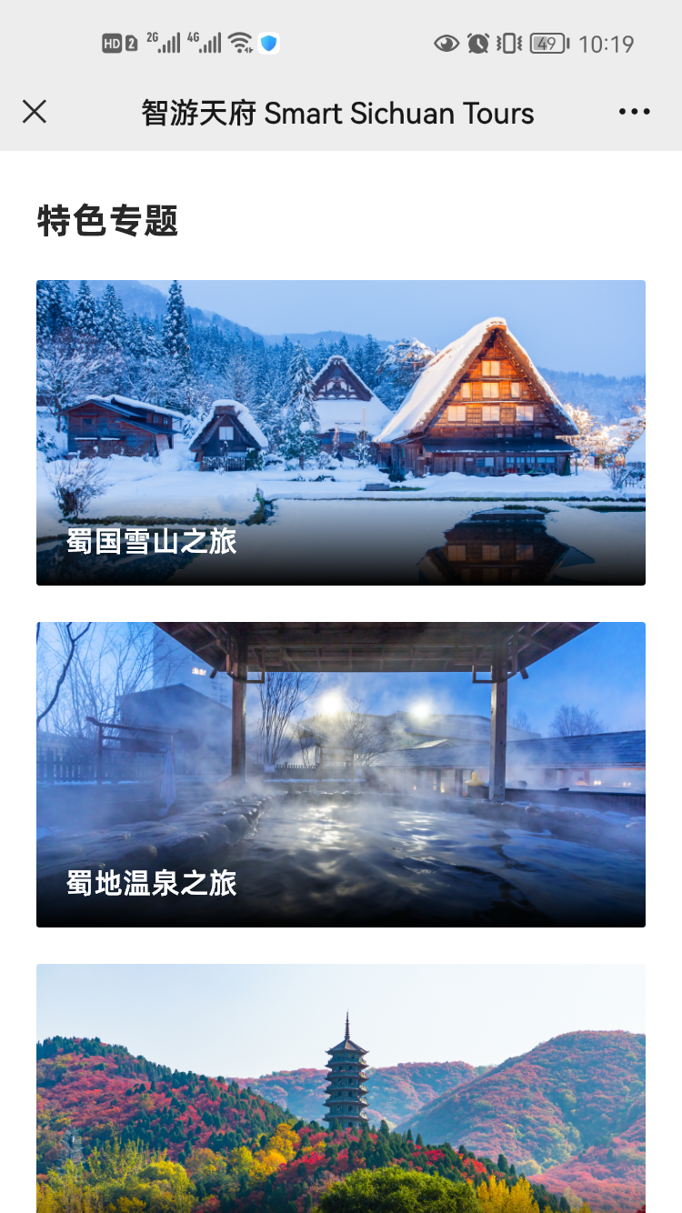
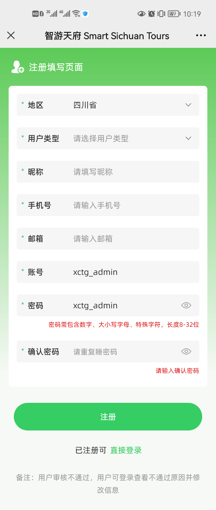
Smart Travel Tianfu is the one-stop public platform: apps, mini-programs and WeChat accounts giving people cultural and tourism information, online enquiries and reservations.
Team target: 100M+ users, 4M registered, and outreach to 3,000+ businesses.
My role: I worked with PMs and UX researchers on the UI and on post-launch improvements driven by user feedback and stakeholder requests — focused on reservations, scenic-spot navigation and real-time event updates.
Designed and prototyped UI and interactions for the MVP and five releases — V1.0.7 through V1.2.0.
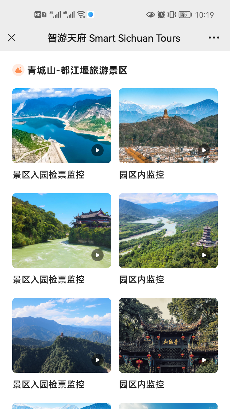
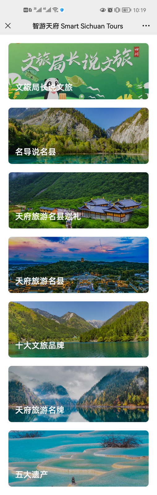
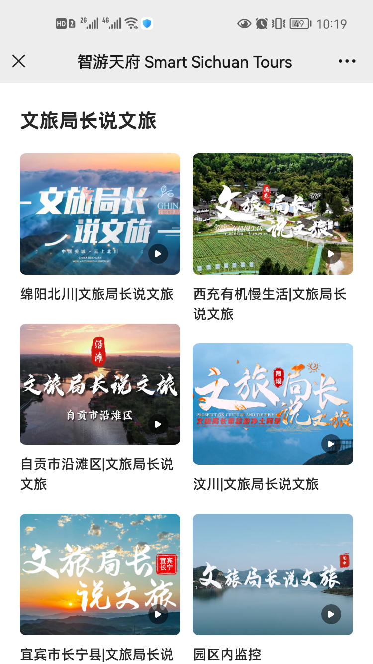
Screens covered reservations, scenic spots, venues, accommodation, dining, exhibitions, performances, live streaming, local products, routes, reviews, complaint reporting and volunteering.
02 — Cultural & Tourism Policy Hub
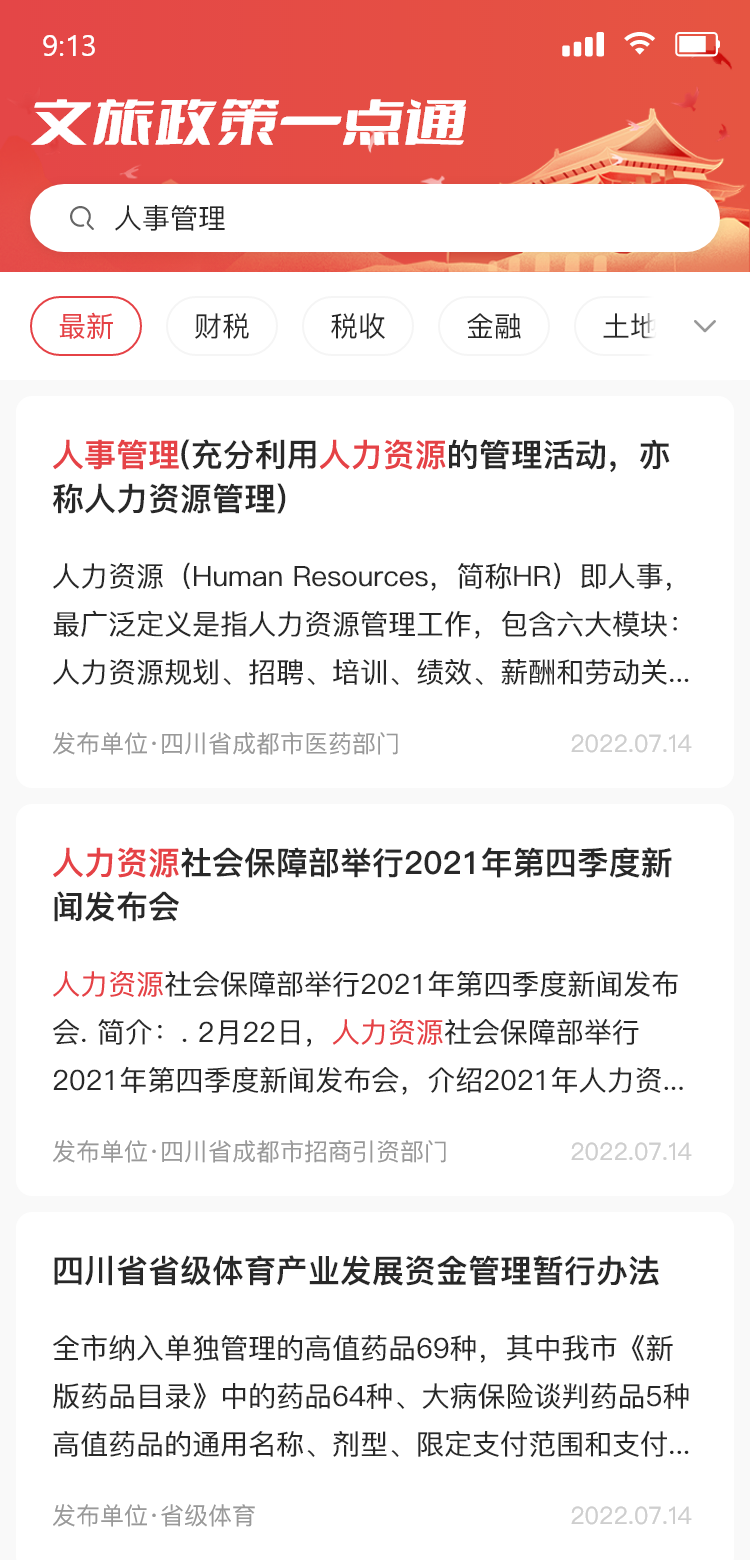
Cultural and tourism policies were spread across authorities and hard to navigate. This was a search and interpretation tool built to make them findable — described as the first of its kind in China.
Policies are long, numerous and issued by different authorities, so businesses that qualify for support often never find out. The Provincial Department of Culture and Tourism launched “One-Click Access” to fix three specific failures:
- Can't find the relevant policy
- Can't understand it once found
- Can't complete the application
It shipped on mobile and desktop at the same time.
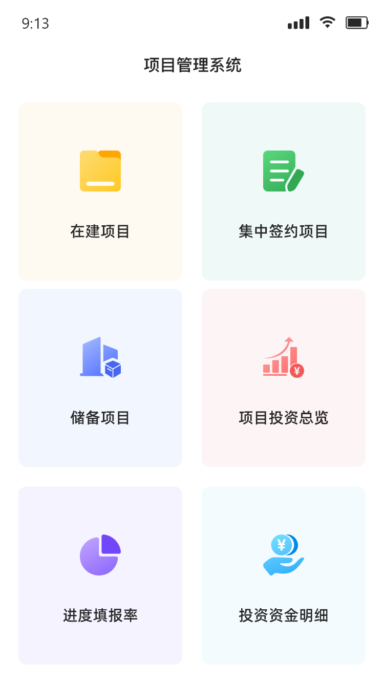
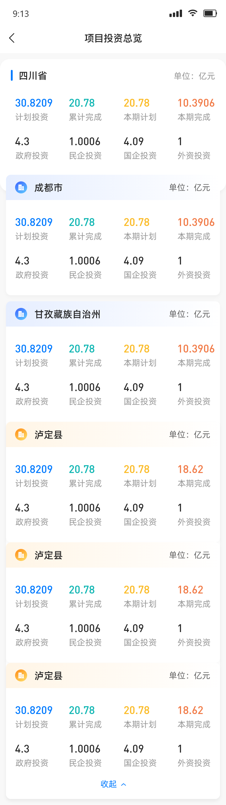
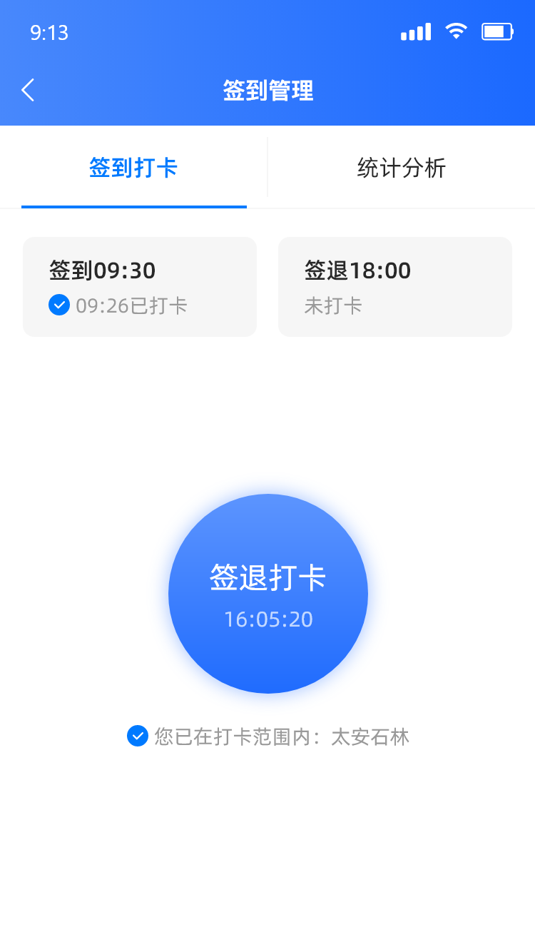
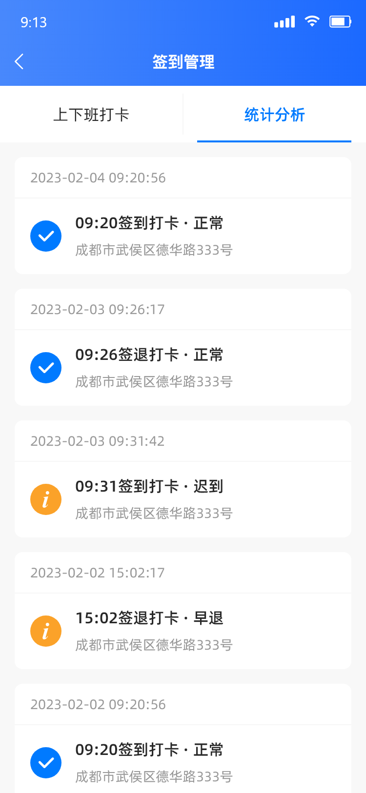
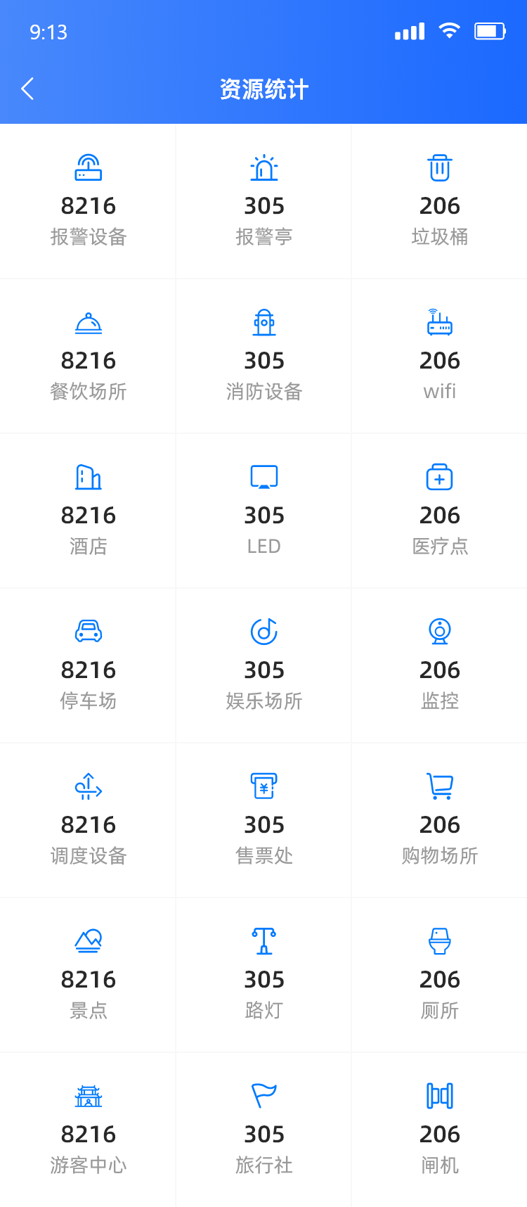
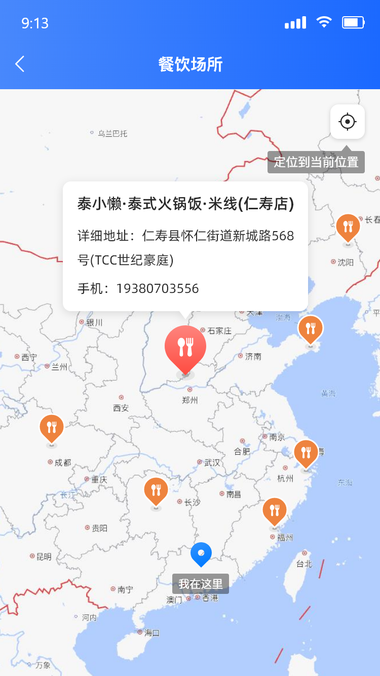
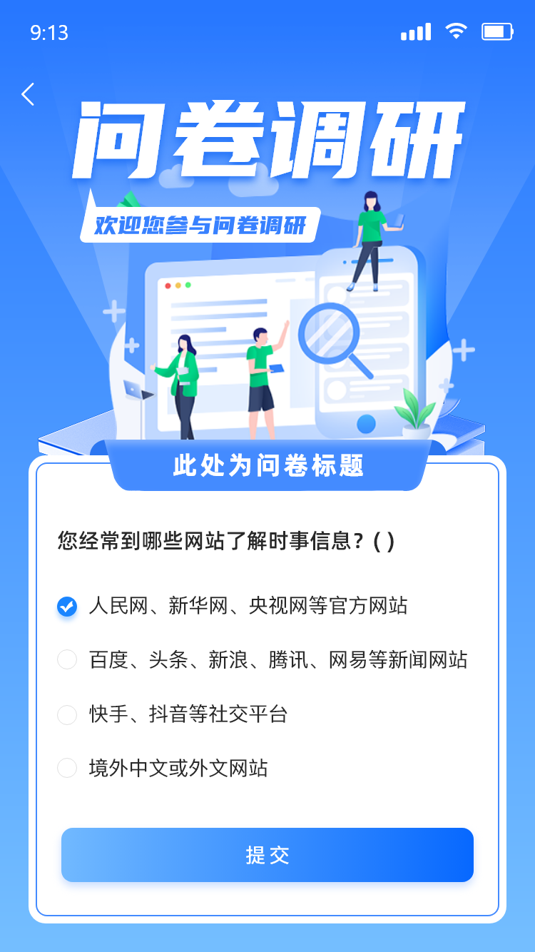
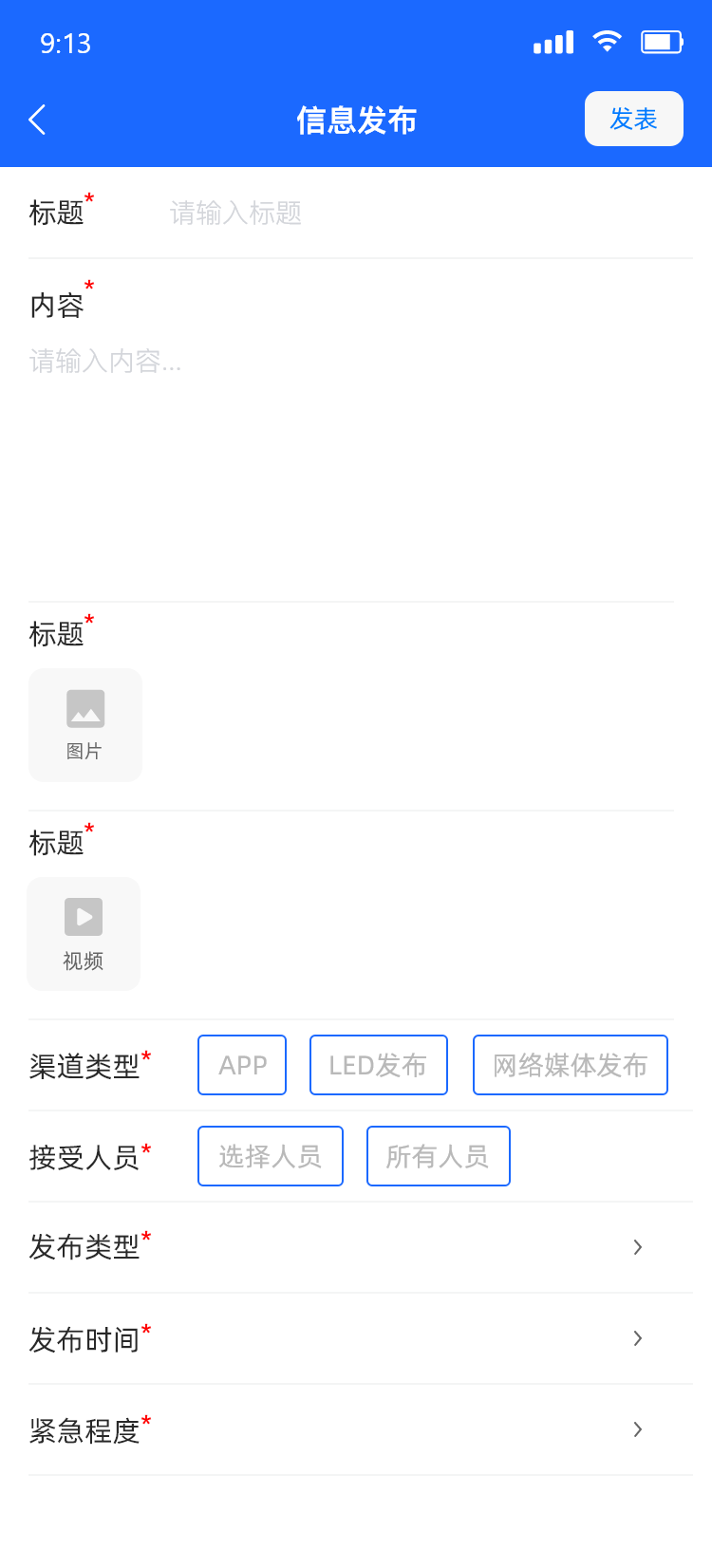
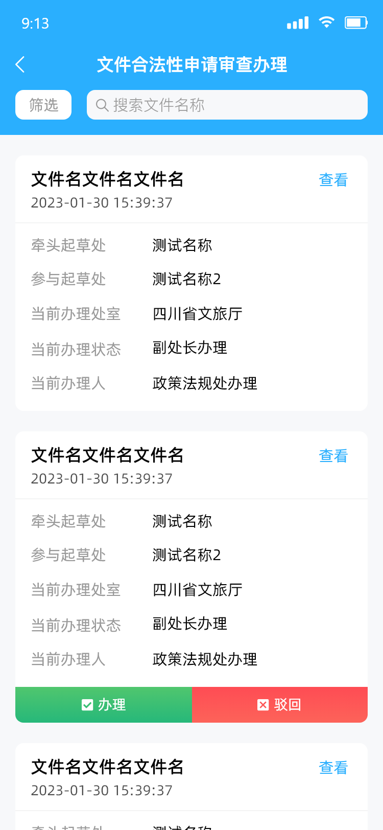
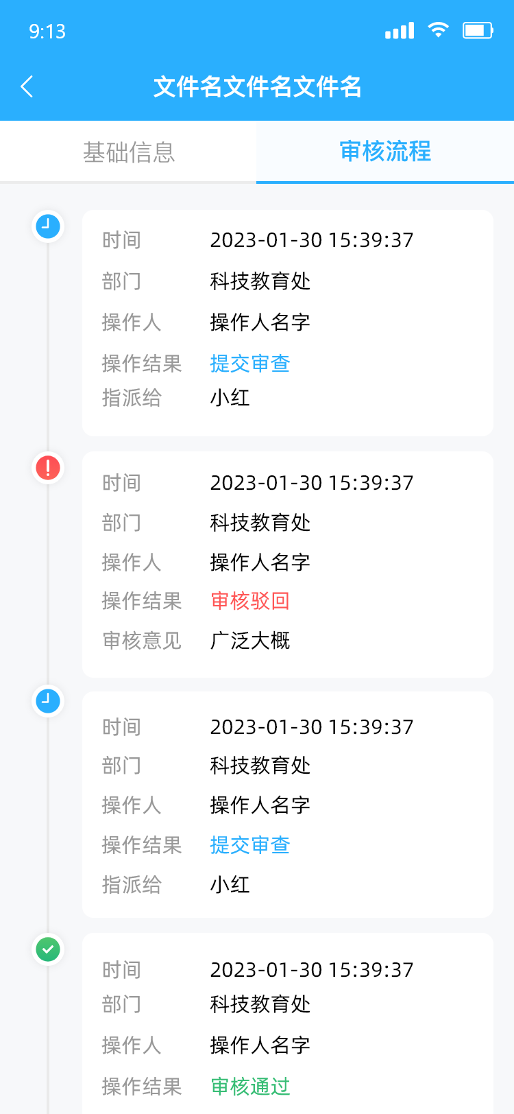
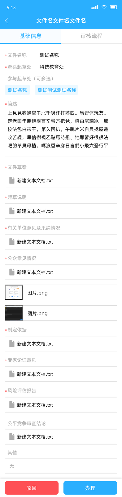
The platform: 300+ regularly-updated policies via categorised search, each with plain-language explanations — plus project management, attendance tracking with location check-in, and application workflows.
My role: with UX researchers, I turned pain points into interaction flows and core features — dashboards, attendance, submissions. The primary users were middle-aged administrators with low digital confidence, so I prioritised accessibility and cut anything that made them hesitate, validated through usability testing.
A live search-and-management tool that made a wall of government policy usable — for the people it was written for, and the people who administer it.
03 — Tourism Smart Dashboard
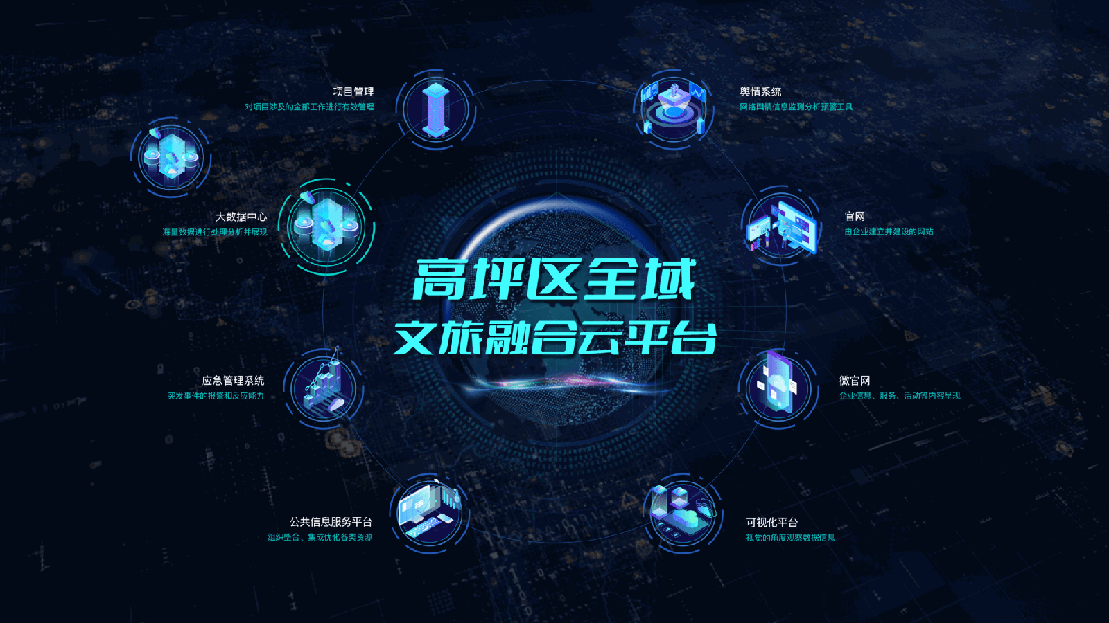
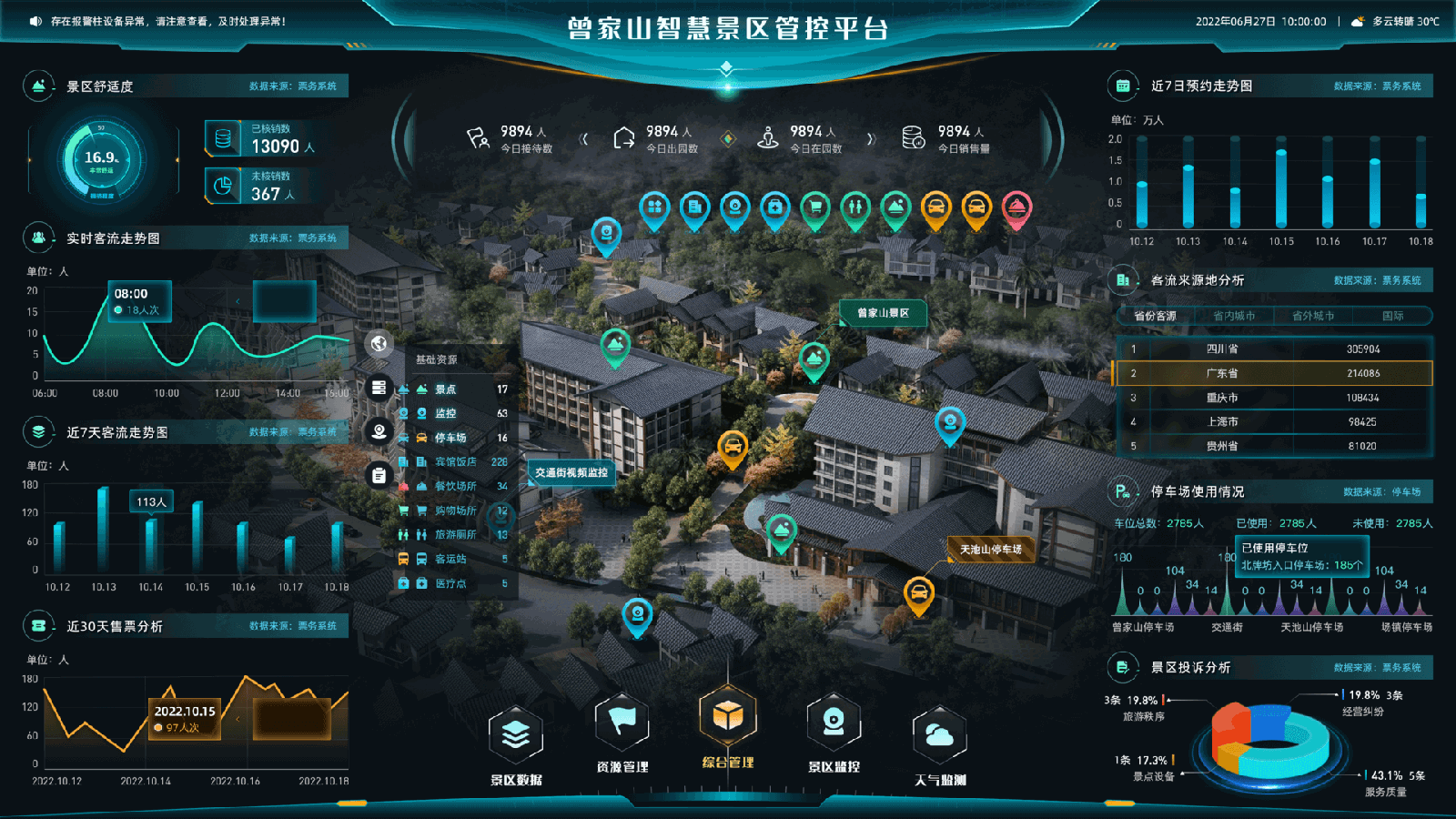
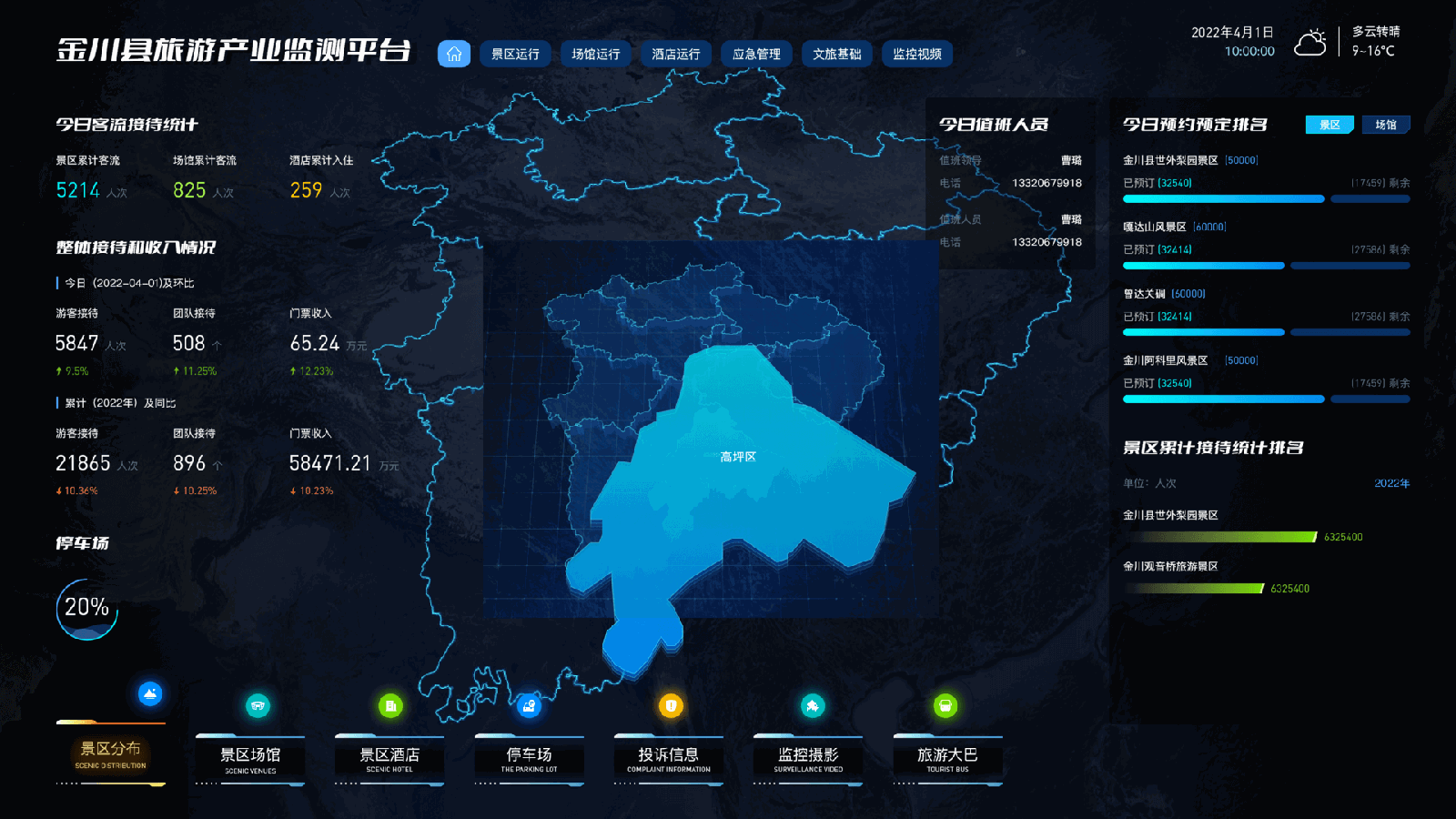
Real-time monitoring dashboards for five city and county control rooms — and the project where I had to work out who the design was really serving.
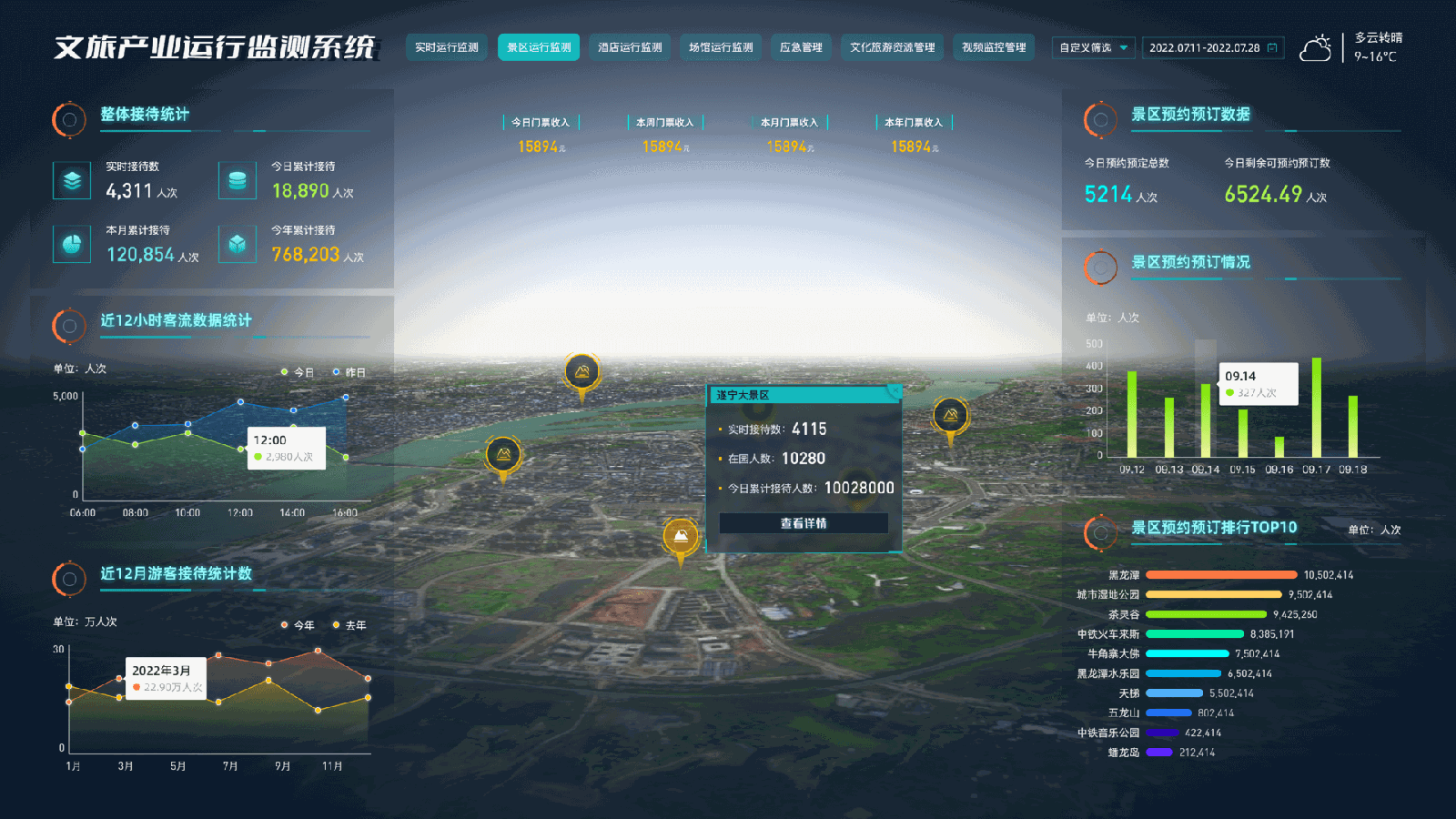
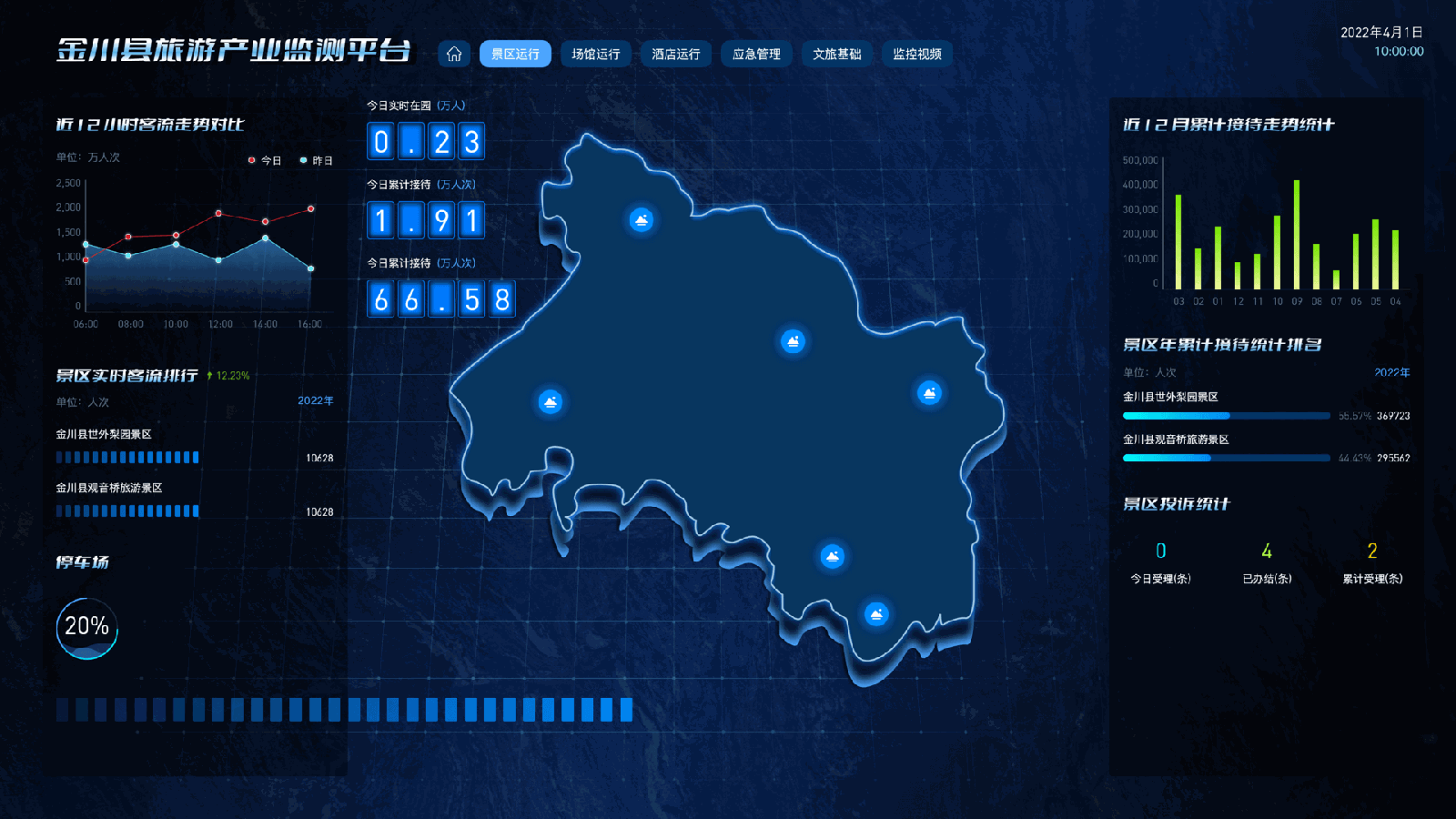
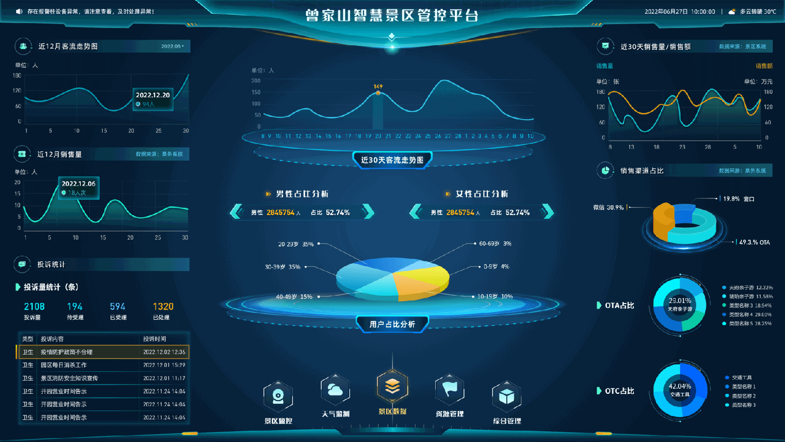
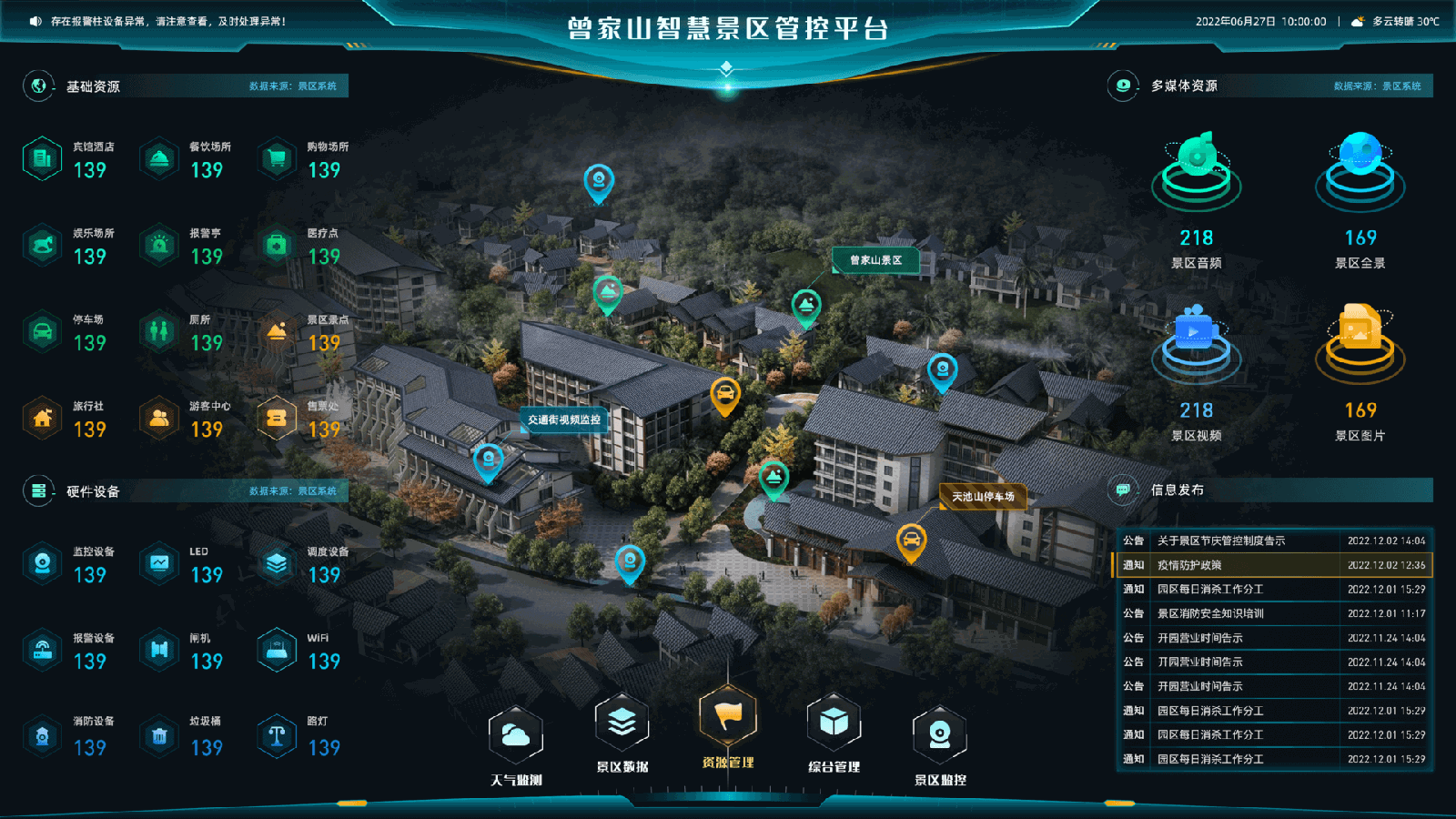
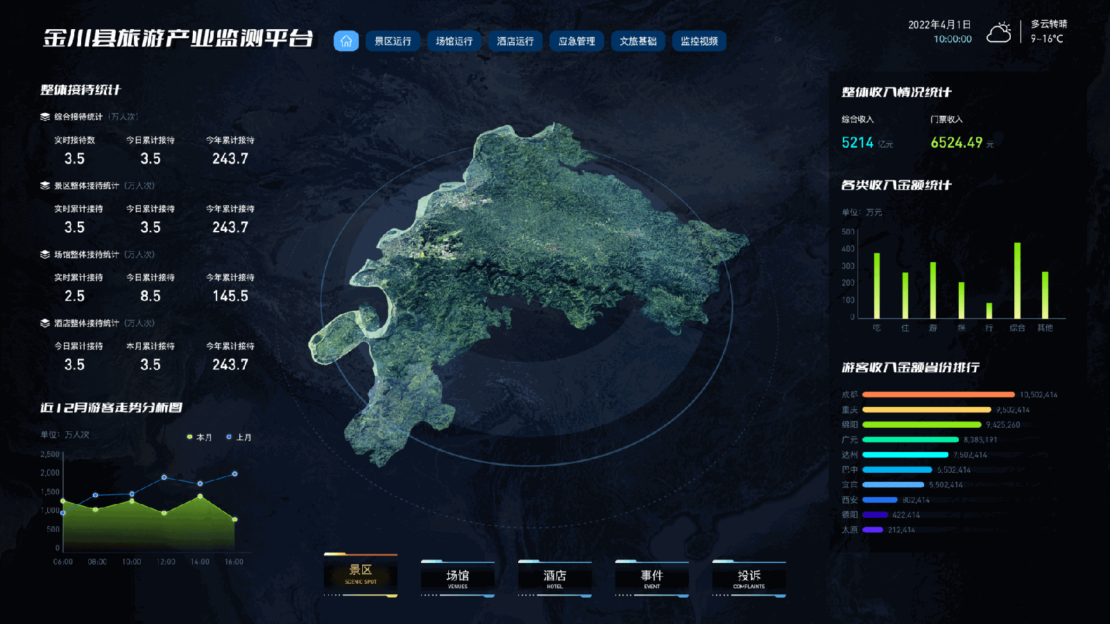
Visual data screens run modern scenic areas — real-time capacity, revenue, visitor flow — letting managers grasp the whole situation at a glance.
They needed to integrate 5G, AI and big data, and pull from scenic sites, government sources and online platforms into one view. Existing setups leaned on hardware, with little oversight.
My role: I designed dashboard prototypes from low to high fidelity for five cities, coordinating with backend engineers, PMs, a 3D designer and the front end to ship them.
The challenge: this dashboard was specified for frontline operators — the people who need to know, in three seconds, whether a gate is about to be overwhelmed. But operators didn't sign the cheque. Leadership did. And leadership wanted it to look like the future.
A NOTE ON DESIGN IN CHINESE BUSINESS CULTURE
Me: “Do they all love ‘Iron Man'-style interfaces?” My PM: “Yes.”
In China's enterprise market, a high-tech look signals real things to leadership: innovation, sophistication, and keeping pace with global standards. Colour carries meaning too — red and gold for fortune and tradition, tech blue for trust and modernity, and black-on-white avoided because white reads as mourning. These aren't taste calls; they're cultural literacy. My job was to give leadership the spectacle they were buying, while keeping the hierarchy an operator needs quietly intact underneath it.
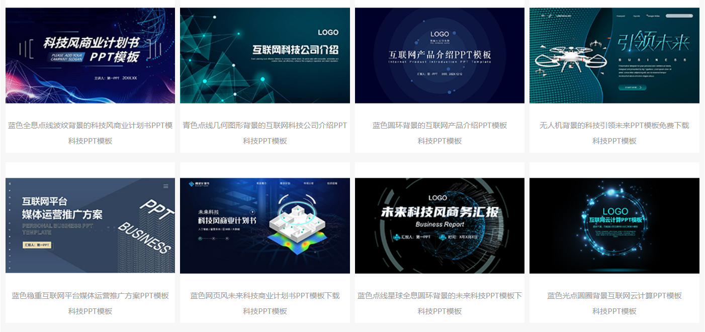
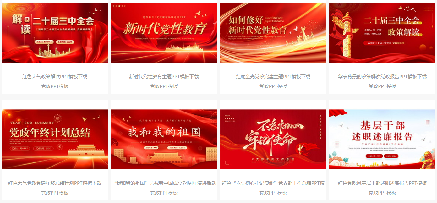
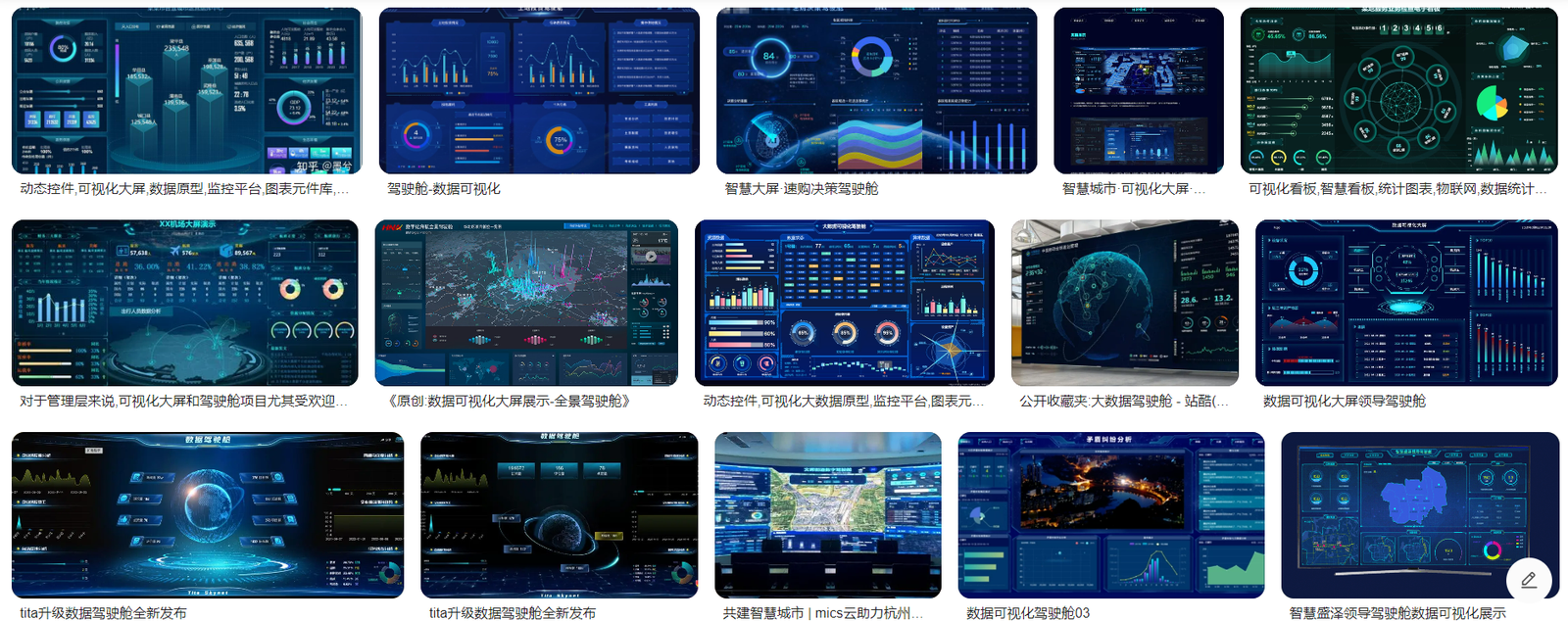
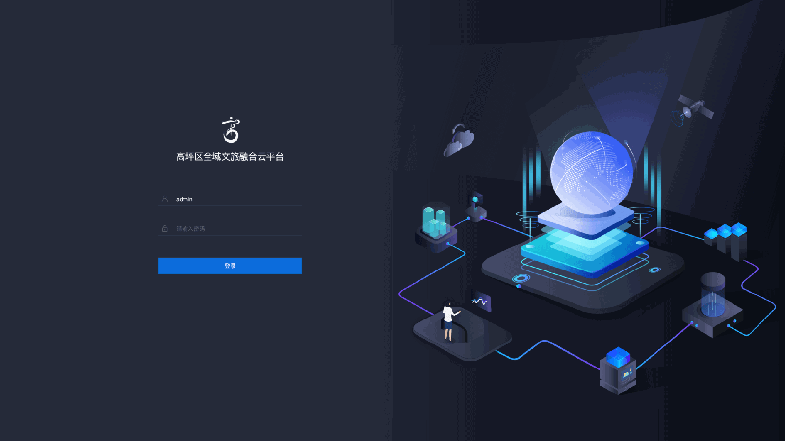
Smart monitoring dashboard screens for five city- and county-level tourism operations, shipped with the 3D designer and the front and back ends.
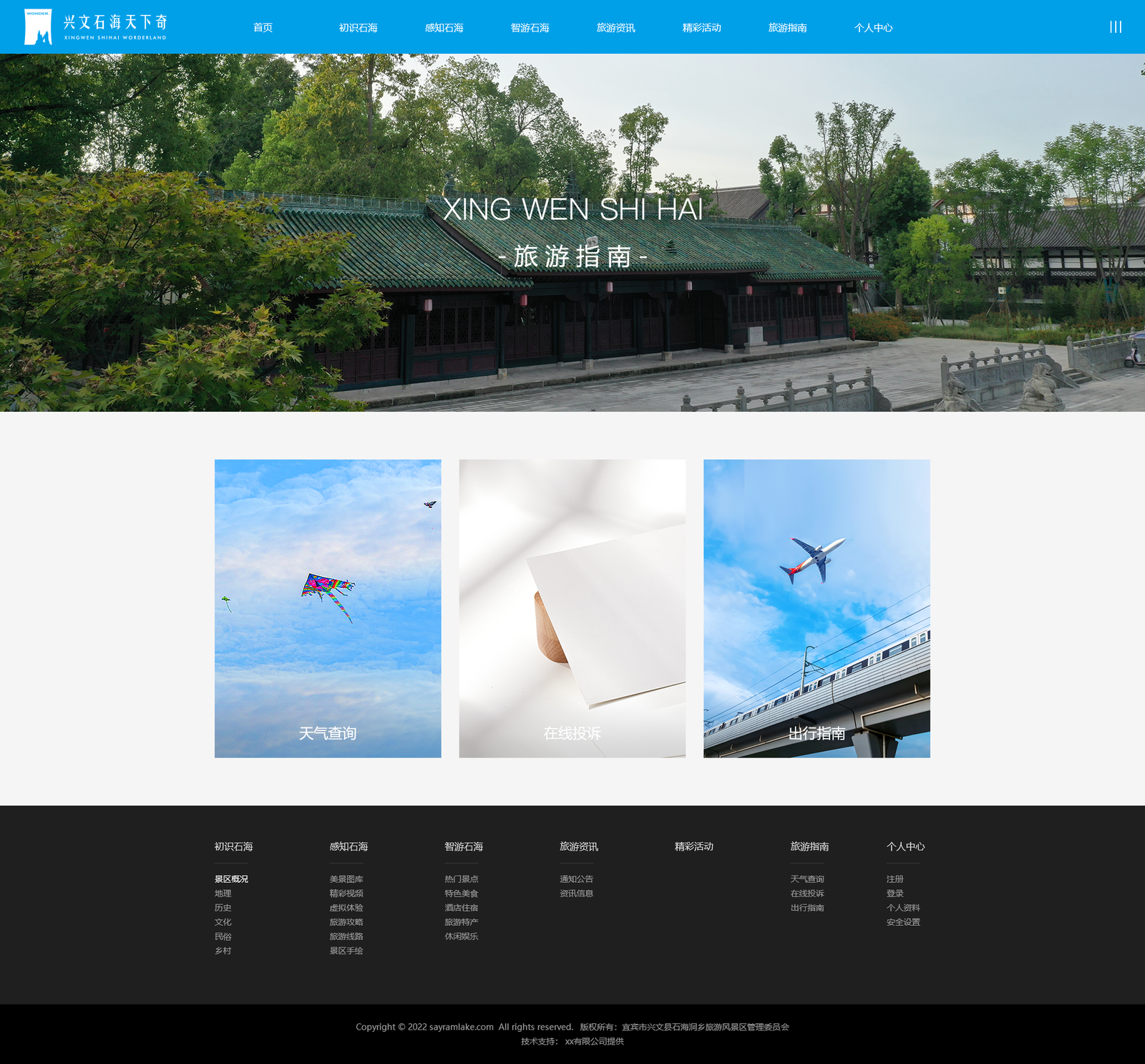
04 — Attraction Websites
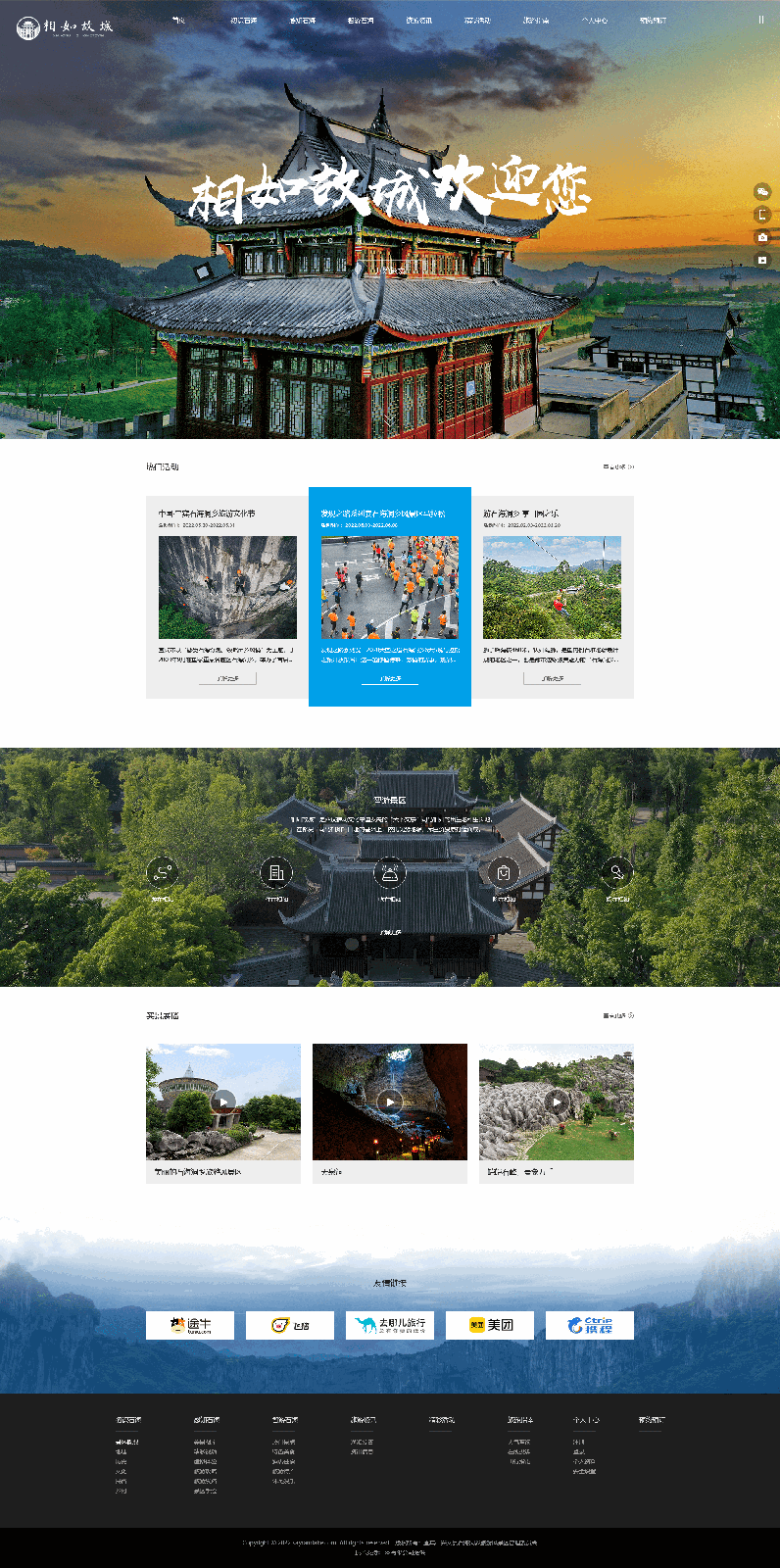
Instead of designing tourism websites one by one, I designed the system that lets non-designers build them.
Tourism departments across China needed to update their own sites in real time, and none of them had developers. A no-code web builder let them log into an enterprise account and edit their city's pages — no code required.
It also standardises the interface of tourism websites nationwide: a visitor who learns one site already knows the next.
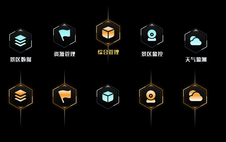
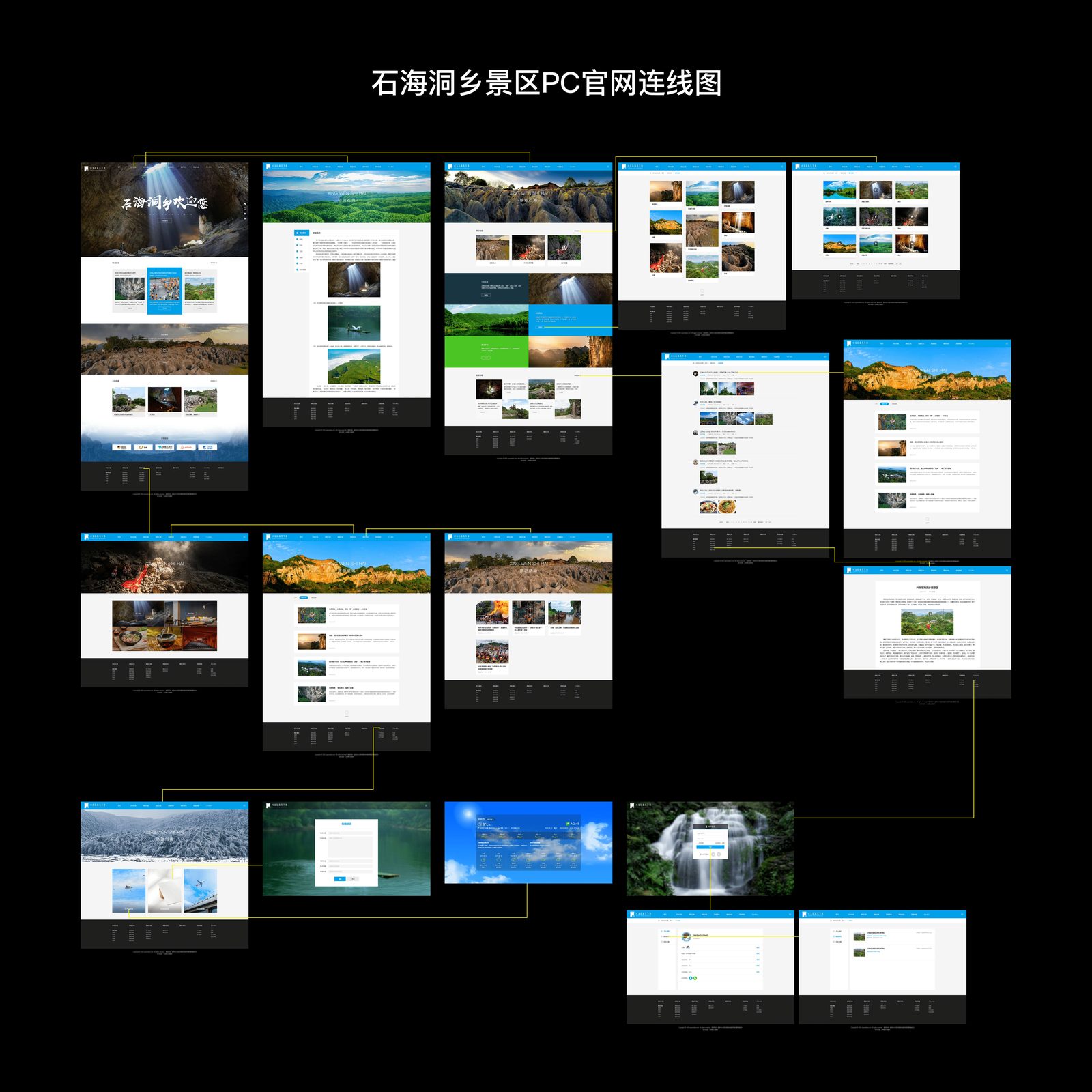
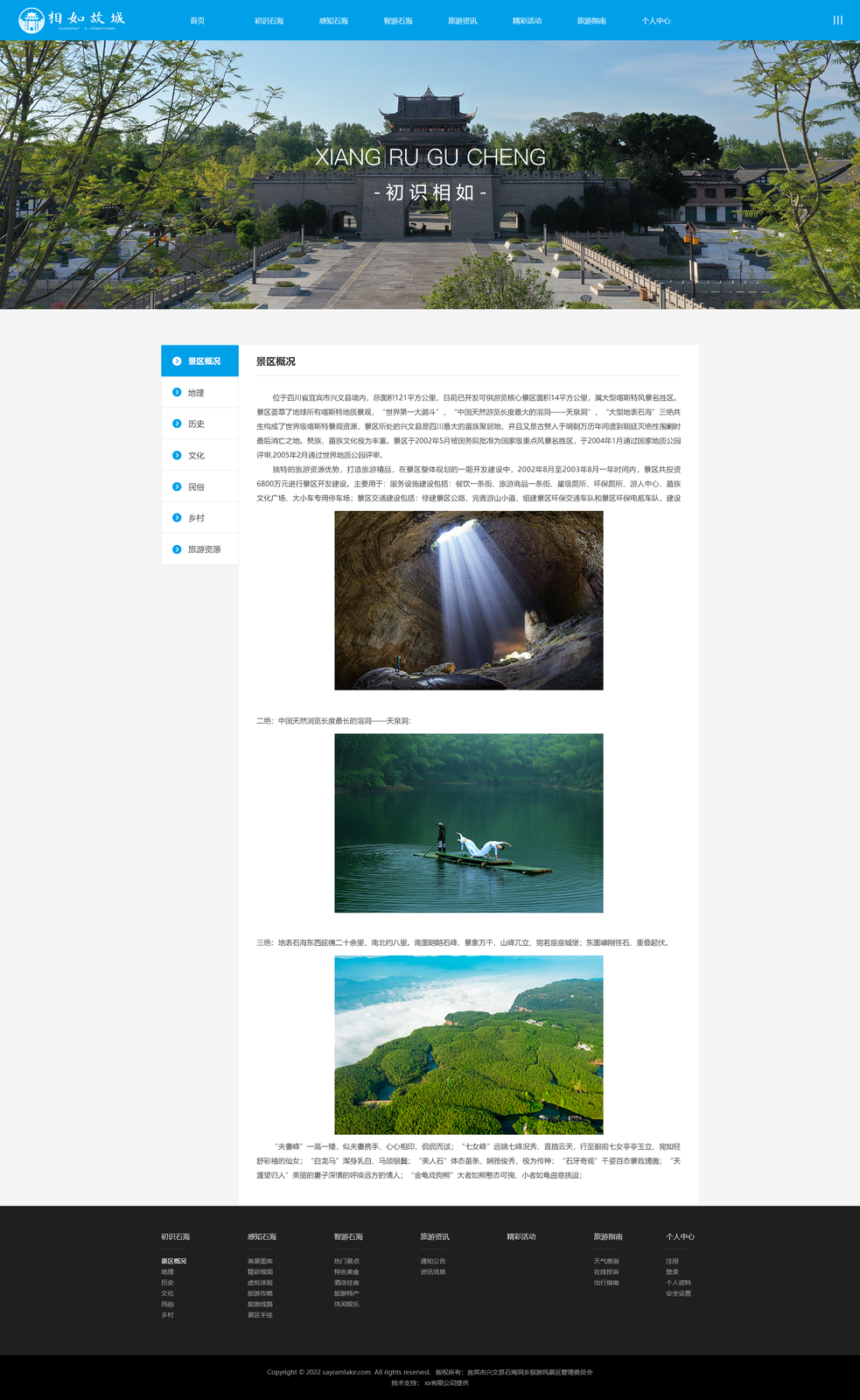
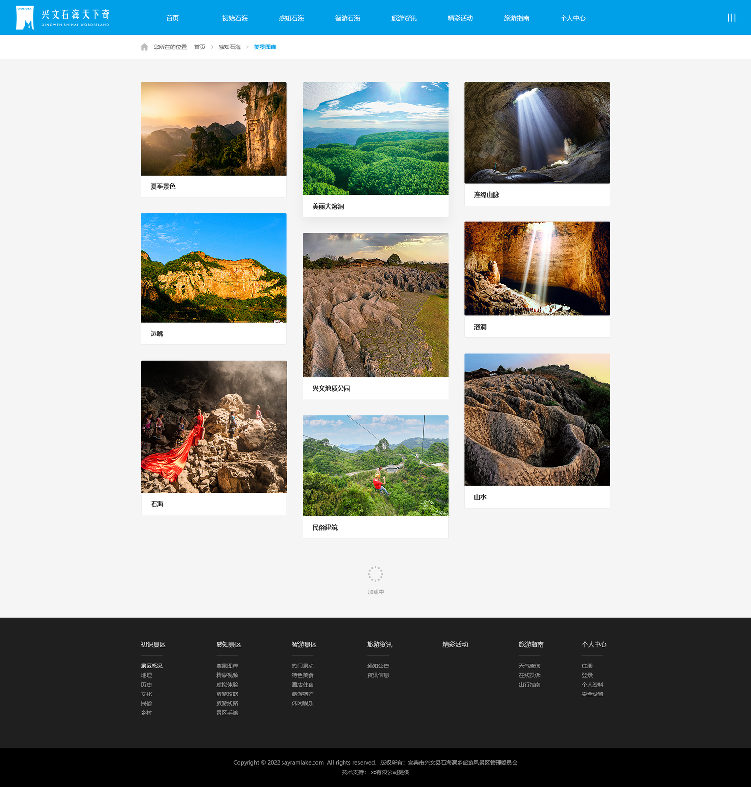
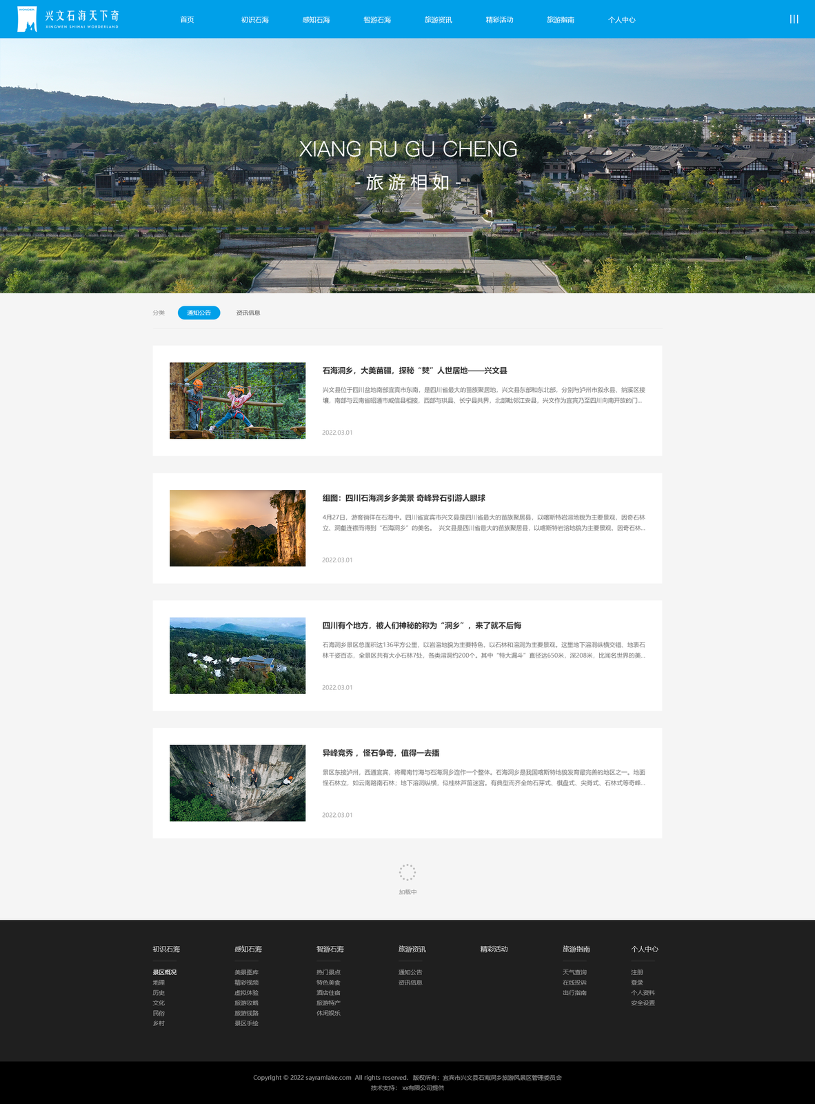
My role: I designed a comprehensive website design system — style blocks, components, and reusable elements like icons and layout structures — plus the sitemap, validated against real stakeholder requirements so every component matched their needs.
Below: a site built with the builder, and the architecture behind it.
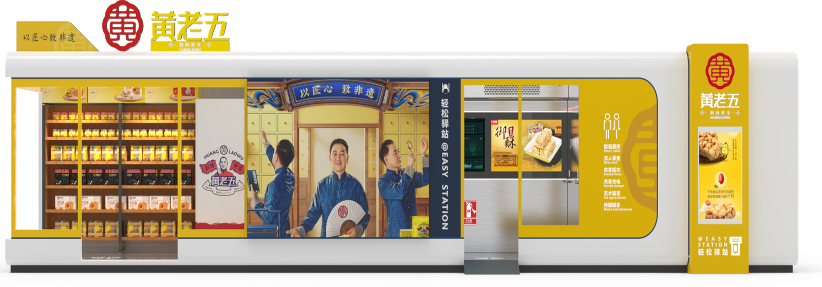
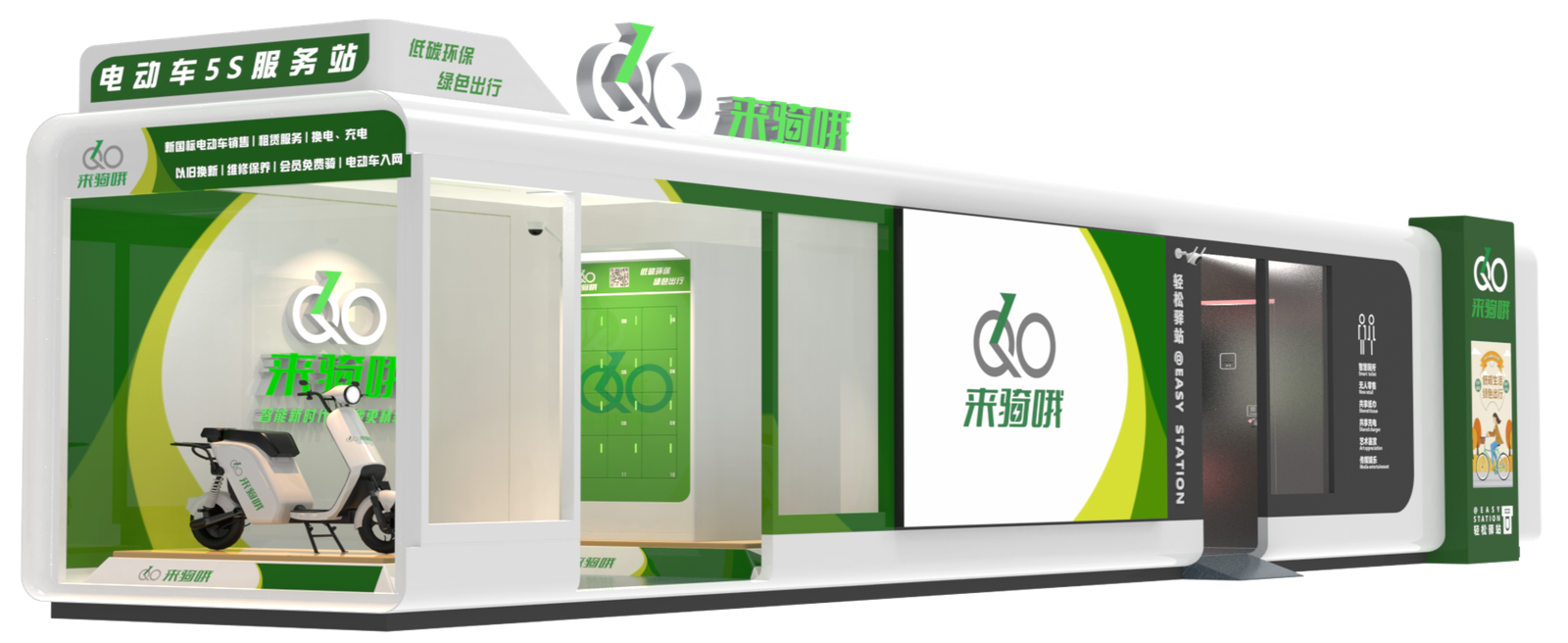
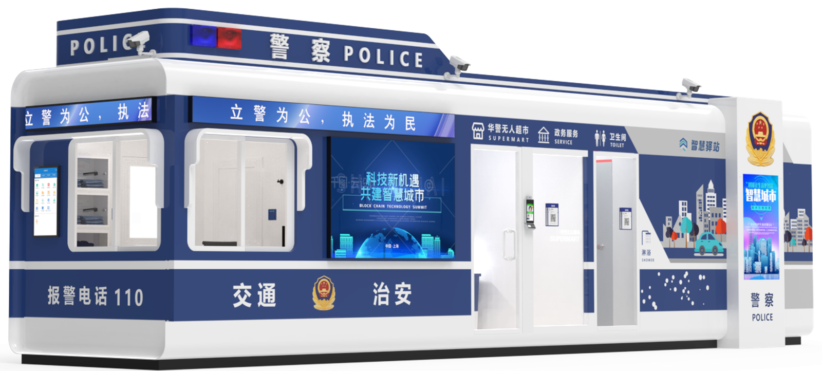
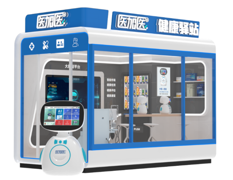
05 — Easy Station + MediPlus
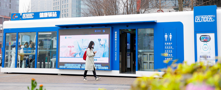
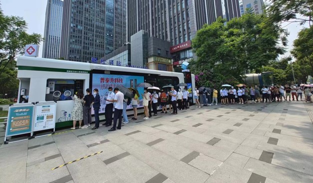
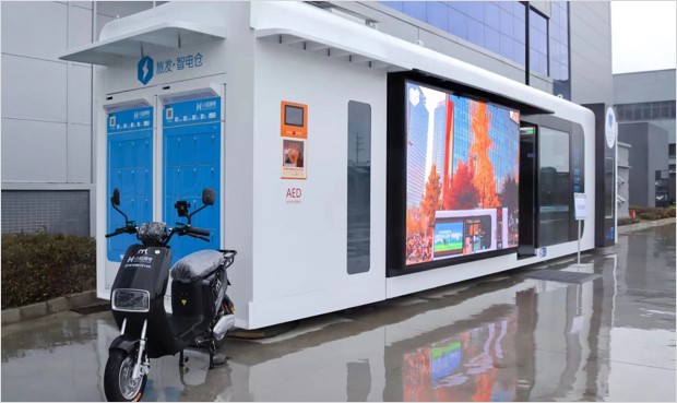
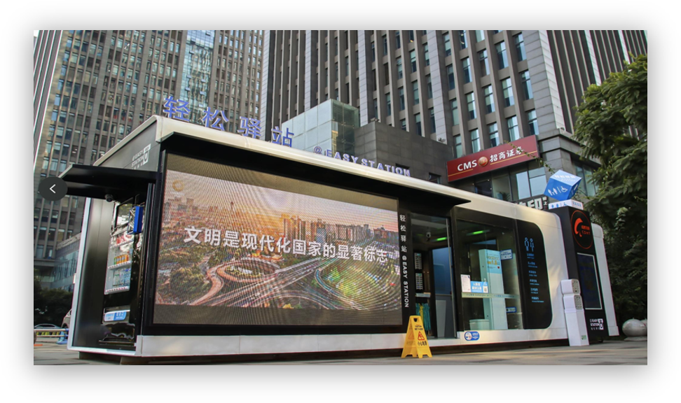
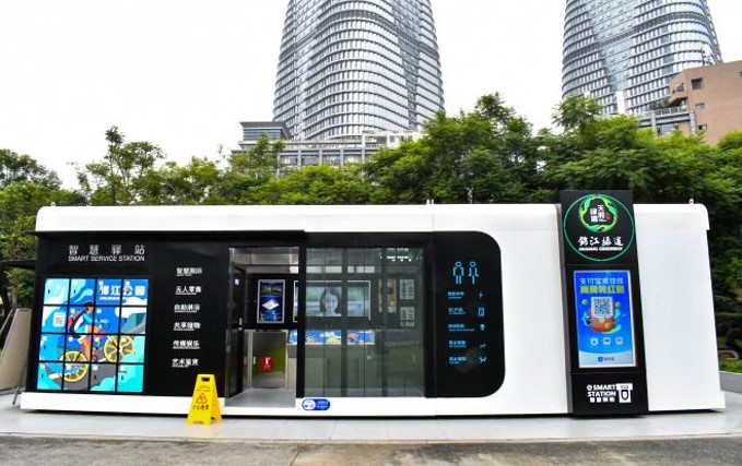
A public service station that combines everyday facilities with access to basic healthcare.
China's healthcare resources concentrate in cities, leaving communities under-served — people ignore minor conditions until they're serious, and wait times punish everyone. The national Healthy China initiative pushed prevention over treatment.
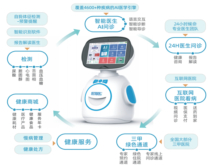
Easy Station uses public restroom infrastructure as the anchor for a dual service point — sanitation plus public health, emergency assistance and commercial facilities. MediPlus adds care: AI diagnosis across 4,000+ conditions, 24/7 video consultations with GPs, insurance-linked prescriptions delivered to the door, and specialist referrals.
I contributed to UI interactions and dashboard layouts with the senior designer — the production files are under confidentiality, so what's shown here is limited.
What I owned outright: the presentation and infographic design for the Easy Station + MediPlus partnership with government entities — turning complex service models into visuals that could survive a room full of officials, working directly with stakeholders and subject-matter experts.
As of July 2023: 400+ service stations across 8 provinces and 13 cities, serving 500M+ people.
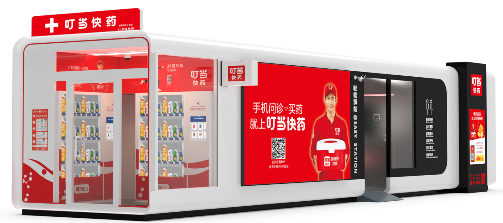
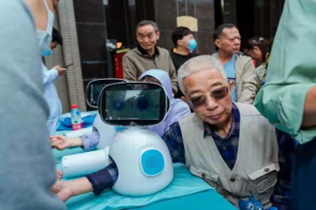
A selection of the presentation and infographic work — the visual language that carried the partnership pitch to government entities:
Reflection
Across six months and five projects, the part that stayed with me was less about visuals and more about judgment.
Kefen taught me that the best-argued design doesn't automatically win. The dashboard showed me that the real user is sometimes the person who signs off — and ignoring that doesn't help the operator either. The better approach isn't to reject the constraint. It's to give the buyer the impressive look they want, while keeping the clear hierarchy the operator actually needs. Both can be true.
The web builder taught me the opposite, more hopeful lesson: when you can't be everywhere, build the system and let it be everywhere for you.
The visa turned out to be a useful constraint. 180 days, no extensions, so every decision came back to one question: does this ship? I learned to reuse aggressively, to build two design systems instead of endless one-off screens, and to tell a debate worth having from one that just costs a week.
What I'd carry into a product team today: the range — four platforms, one voice — the systems thinking, and a practical instinct for reading who in the room actually decides.